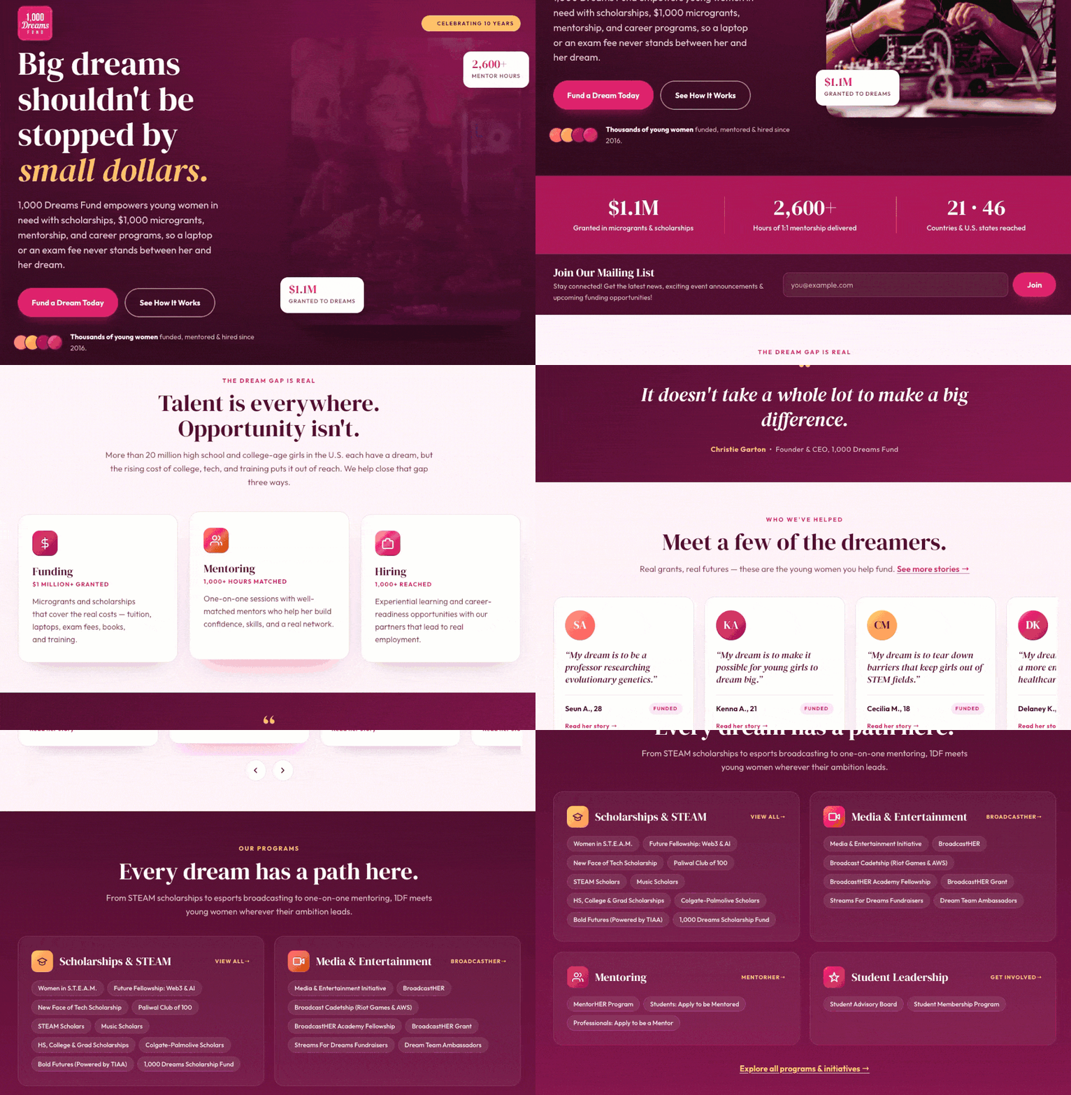
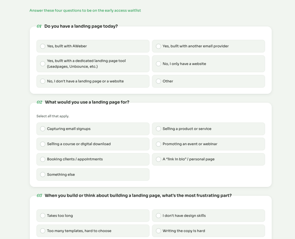
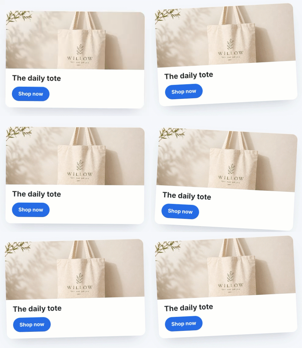
Every automation you’ve built keeps working long after you’ve stopped thinking about it. That’s the point of automation, but it’s also why most people never find out if a workflow is actually converting as well as it could.
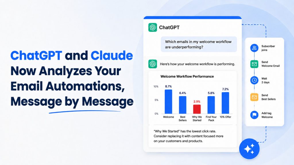
AWeber’s ChatGPT and Claude plugin now gives you that answer directly. Ask about any automation and get a real analysis back. What’s working. What’s not. And exactly what to improve. All without opening AWeber.
Know exactly which email to improve
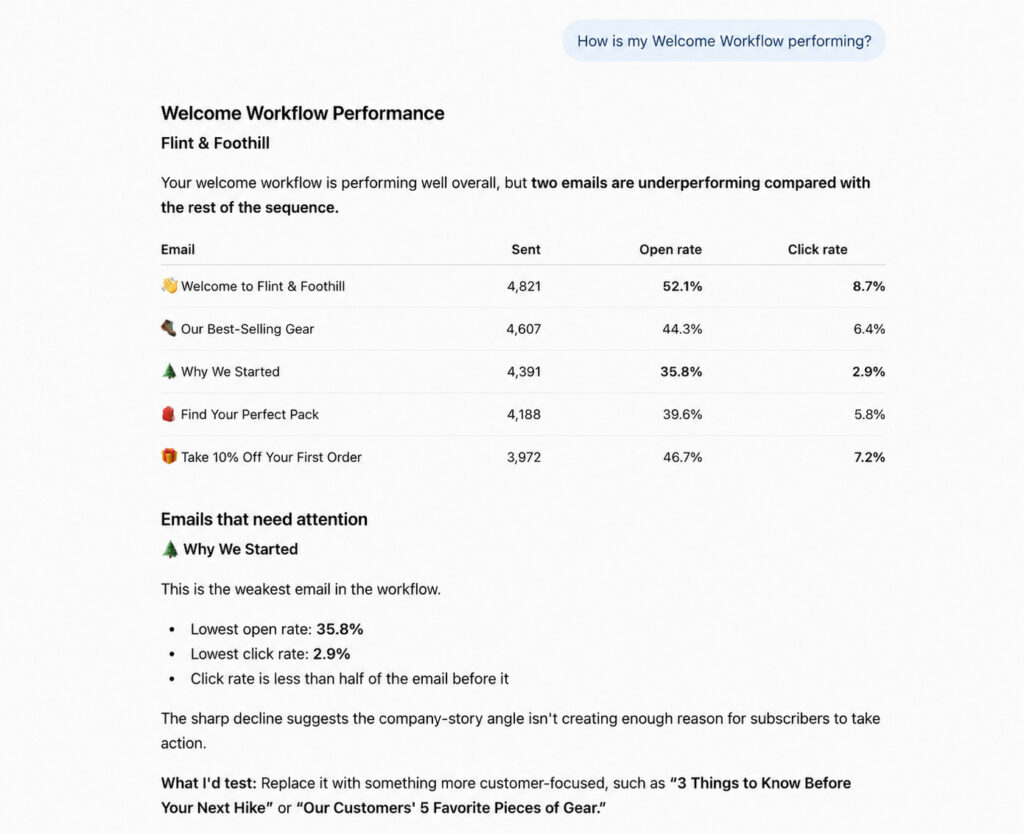
ChatGPT and Claude break down how the automation is performing: what’s working, what’s not, and exactly where the opportunity is.
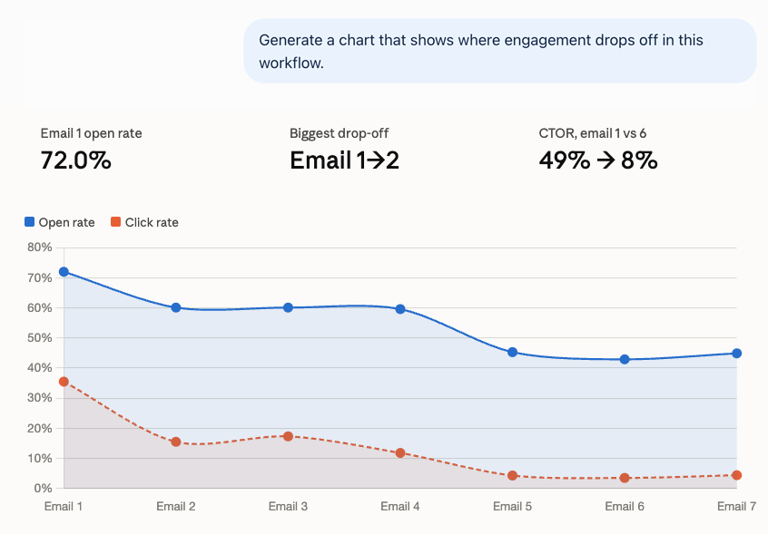
You can ask for an analysis to see the exact step where engagement drops the most. So instead of guessing which email is losing people, you know precisely where it happens.
Catch list health issues before they spread
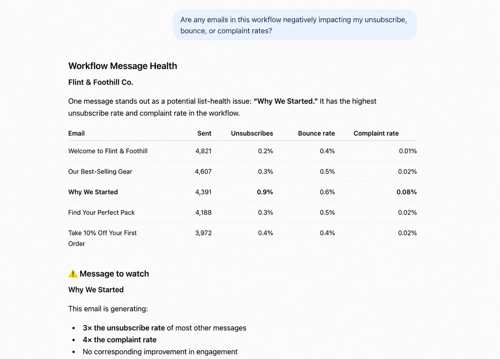
Ask about unsubscribes, bounces, and complaints for any message in the Workflow, and you can catch a message quietly hurting your list before it affects the rest of your sends.
Find out what your subscribers actually click
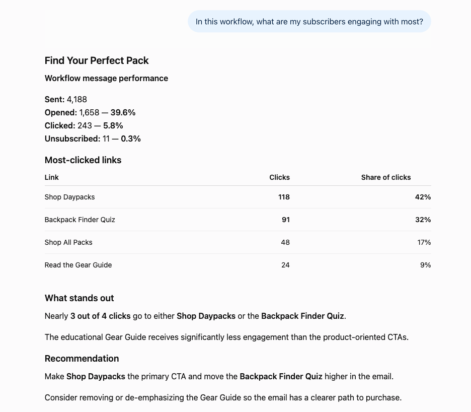
If your automation links to a few different products, offers, or pages, ask which one is getting clicked.
Know what subscribers actually want, so you know what to feature next.
See every Workflow at a glance
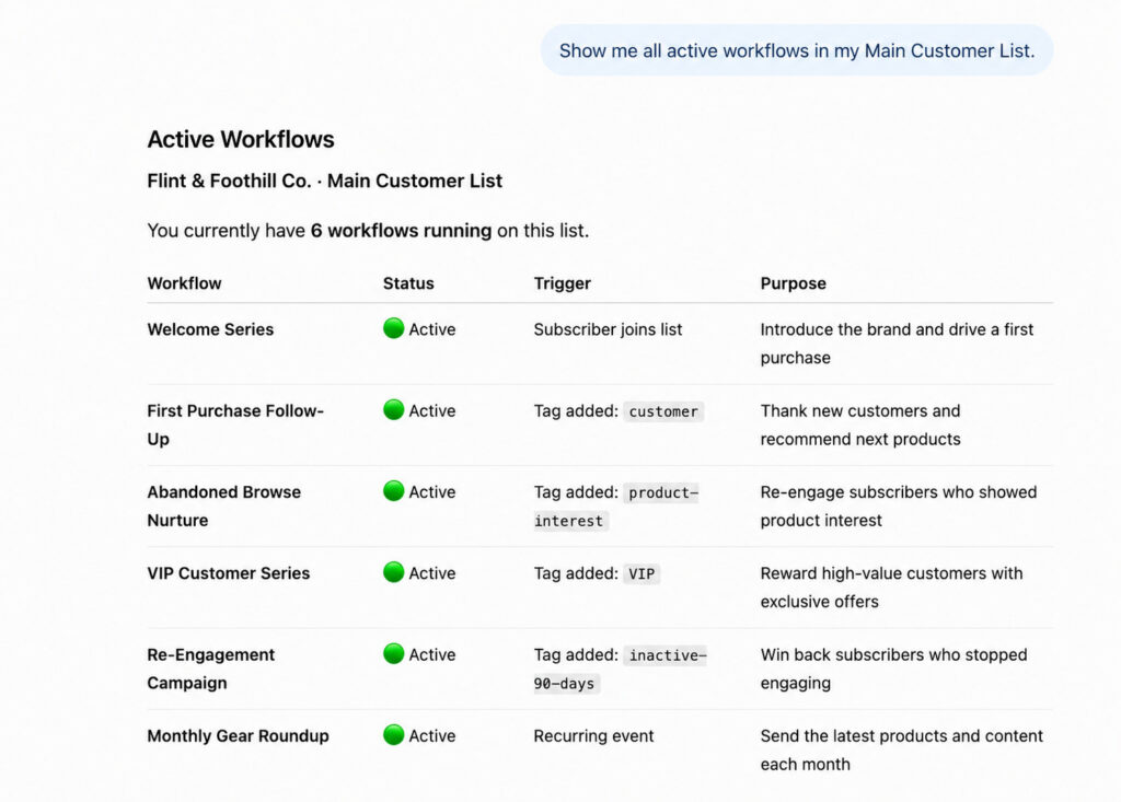
Ask ChatGPT to list every workflow running on a list, and you get the full picture of what’s live without opening AWeber to check.
See the path every subscriber takes
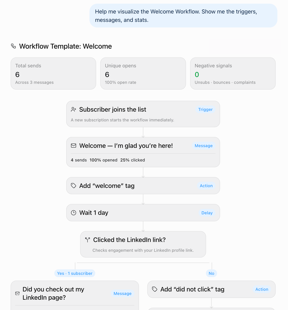
You can ask ChatGPT or Claude for visual of your Workflow. It will show every trigger, every branch, every message in order.
Get started
If you’re already connected to AWeber’s ChatGPT or Claude plugin, there’s nothing new to set up. Open ChatGPT or Claude and ask about an automation you’re running today.
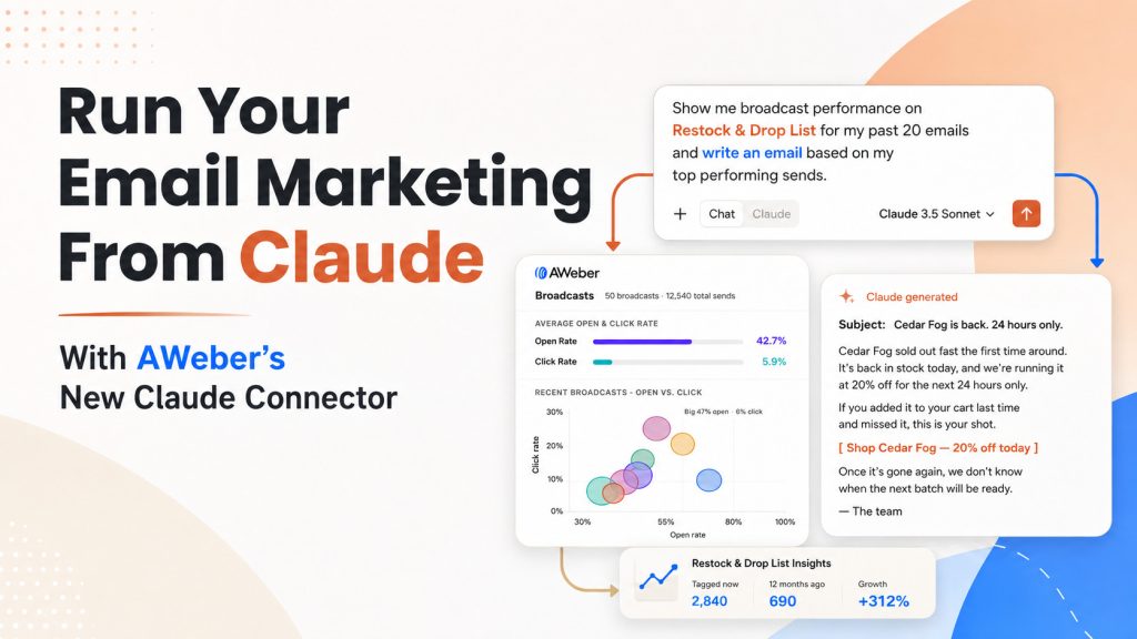
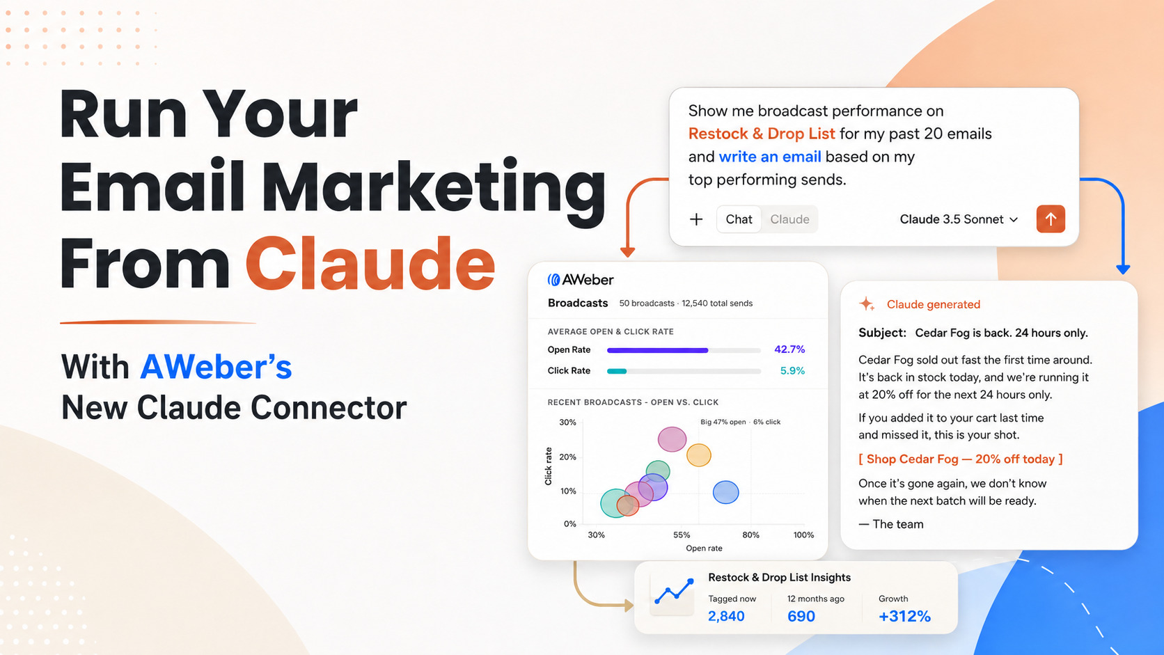
You can now manage your AWeber account without leaving Claude.
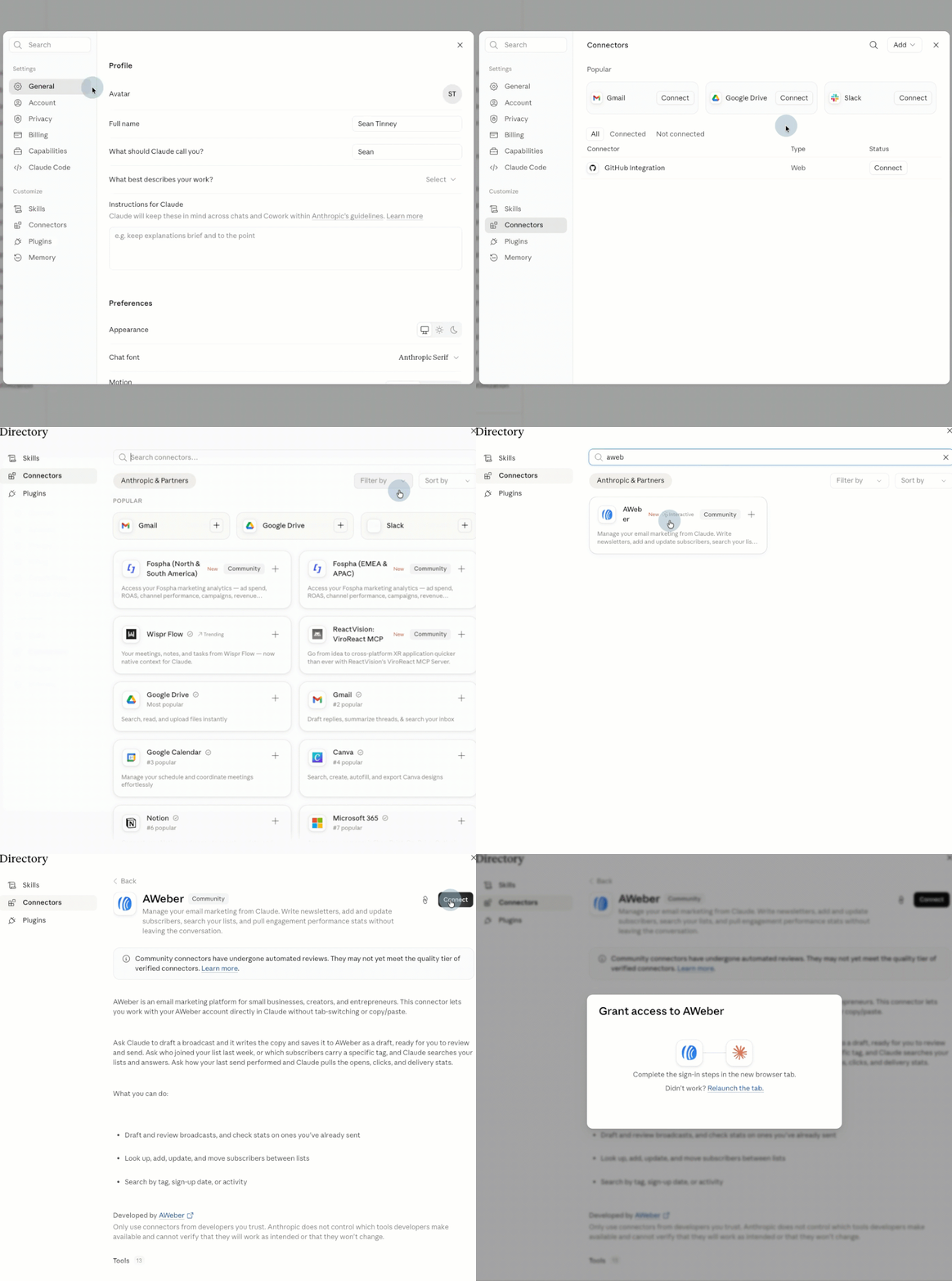
We’re is live in Claude’s connector directory. Search for AWeber, click Connect, and authenticate your account. That’s the entire setup.
From there, ask Claude to draft a broadcast, add a subscriber, or pull your open and click rates. It happens right in the conversation, using your real AWeber data.
What You Can Do From Claude
Once connected, start creating better content and making more informed decisions.
Check broadcast performance
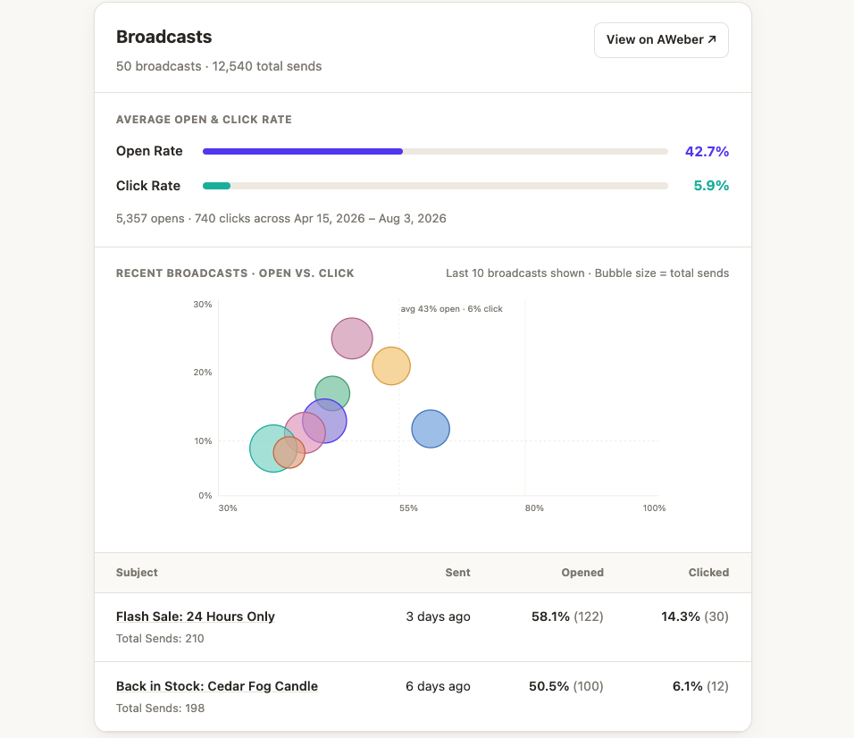
Ask how your last broadcast performed, or how several stack up against each other, and get open and click stats back in a table or chart.
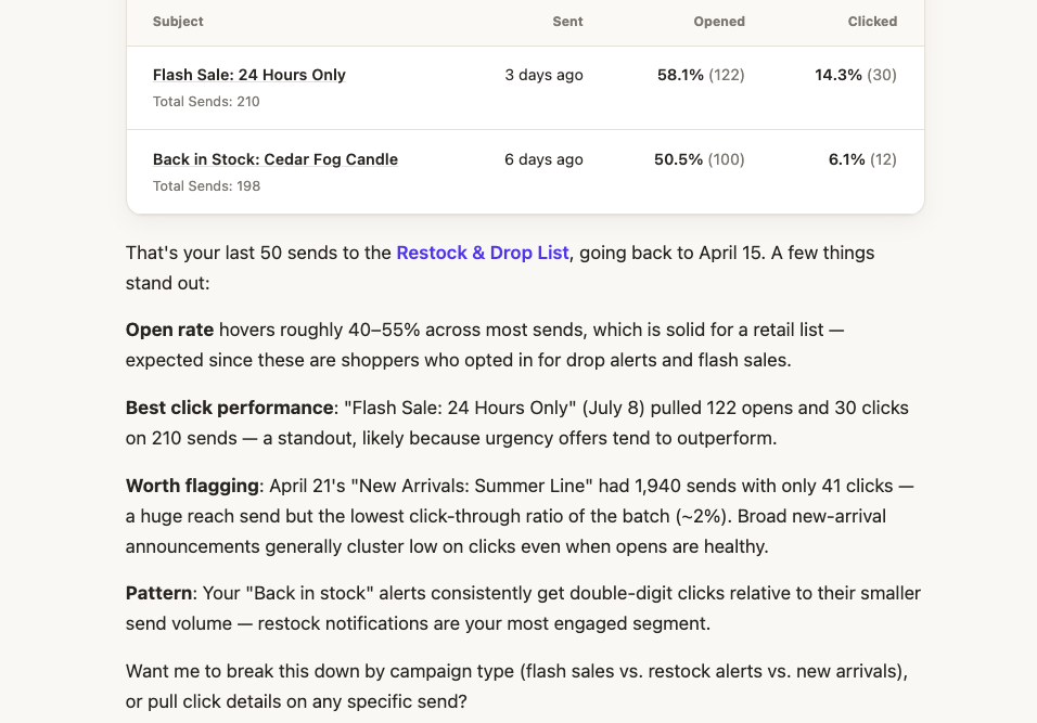
Plus a recap of what worked and what didn’t. Which subject line pulled the most clicks. Which send underperformed relative to its size. Whether a particular type of email consistently does better with your list.
Draft and review broadcasts
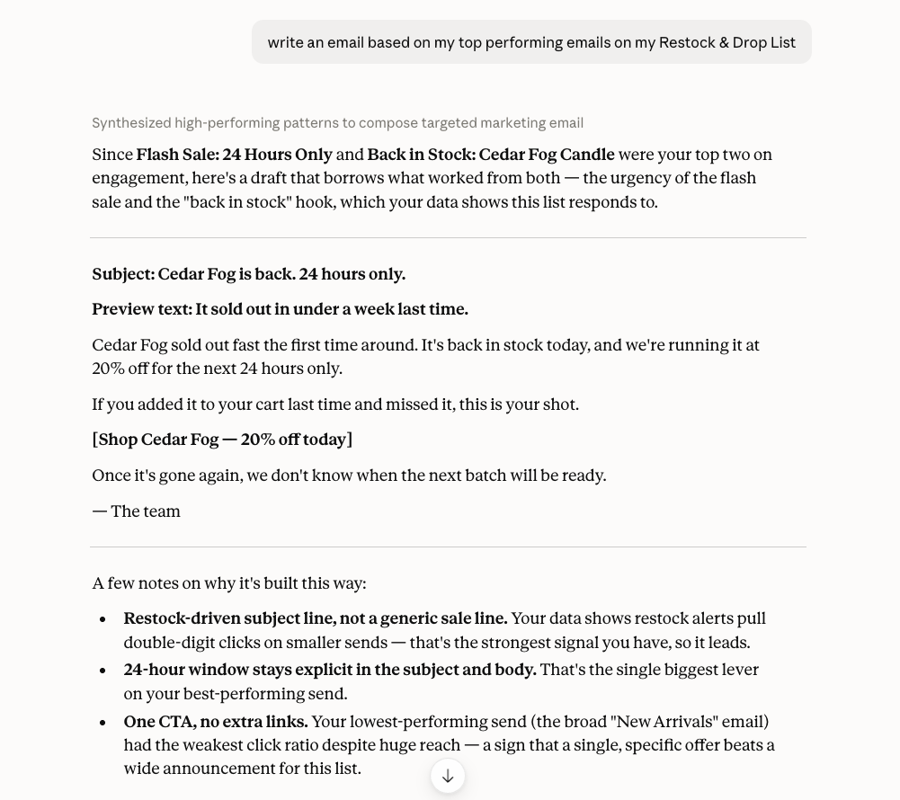
Ask Claude to write a newsletter for a specific list, in the tone of your recent sends. It writes the copy and saves it to your account as a draft, ready for you to review and send.
Manage subscribers
Look up, add, update, or move subscribers between lists. Search by tag, sign-up date, or activity.
Manage lists and tags
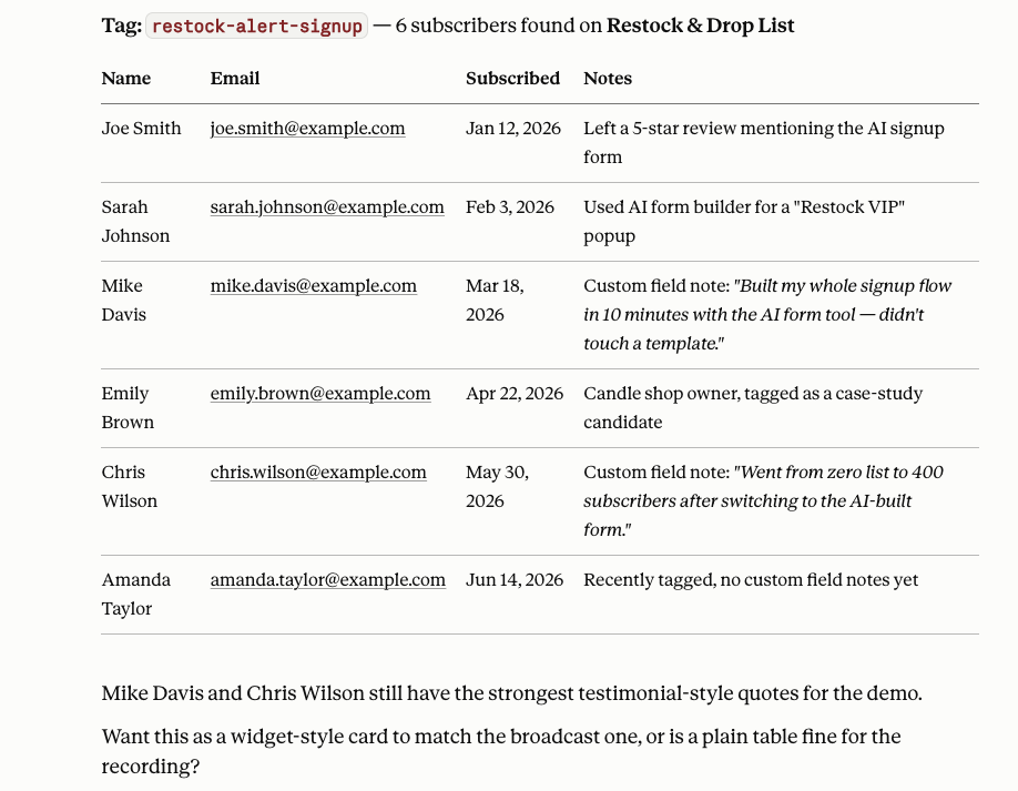
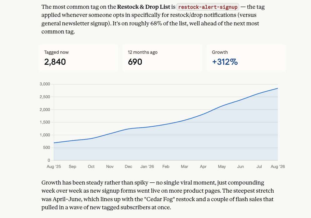
Ask which of your lists is largest, or what the most common tag is on a specific list. Claude pulls the answer straight from your account.
Build signup forms
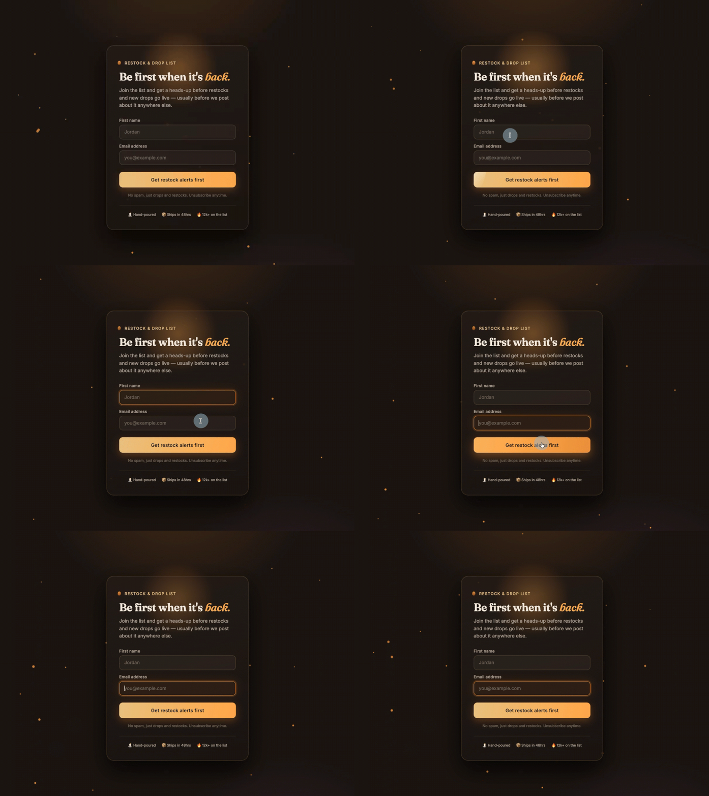
Ask Claude to create a signup form for a specific list, with the fields, tags, and placement you want. It creates the form, ready to drop into your site.
Connect your account
→ Open Claude → Go to Settings → Connectors → Search “AWeber” and click Connect → Authenticate your account
Start a new chat and ask Claude something like “Who is the latest subscriber on [list name] in AWeber?” You’ll get a real answer pulled straight from your list.
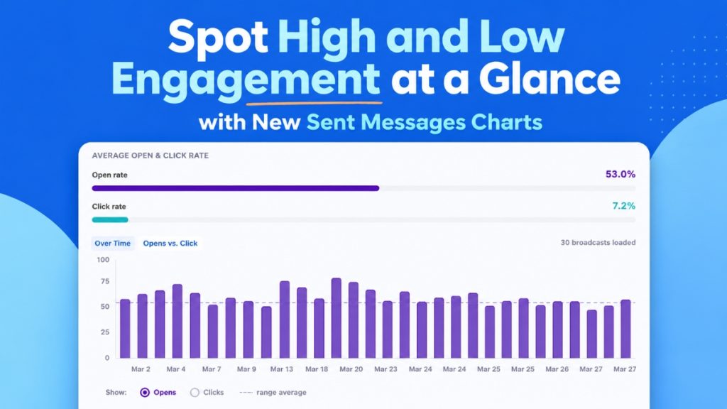
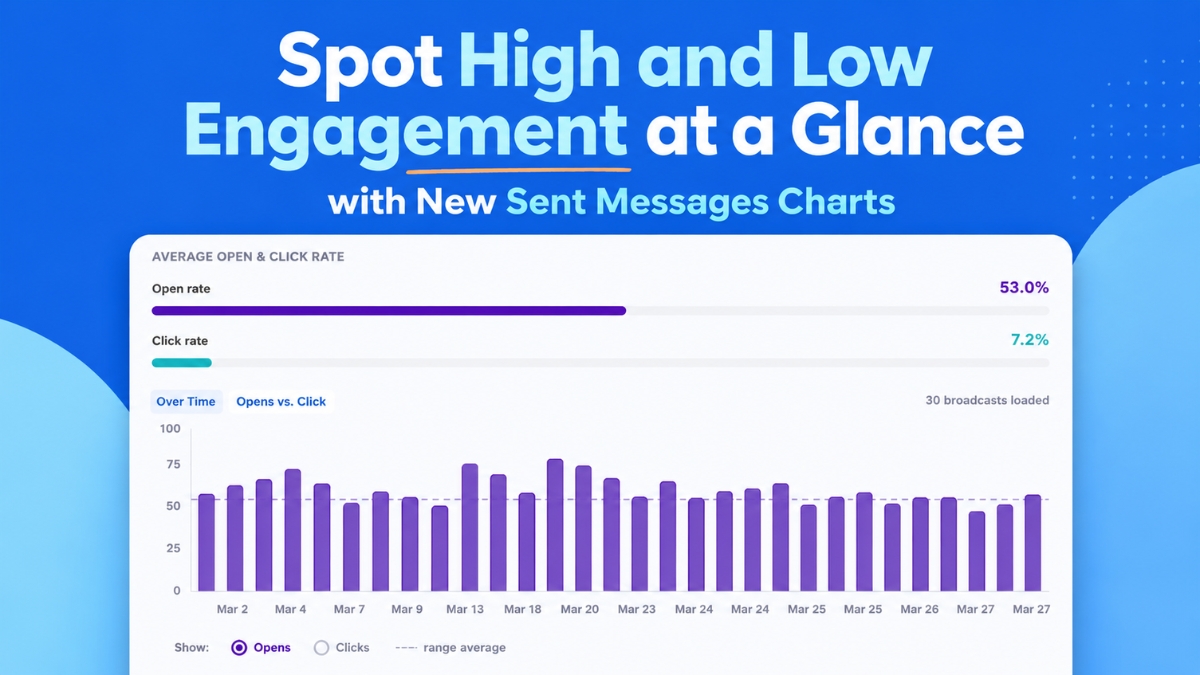
Open rates, click rates, and email comparisons appear as a chart you can view at a glance. See which emails drove action and which ones didn’t. Then send more of what works.
Patterns and outliers surface at a glance, no digging required.
See engagement trends over time
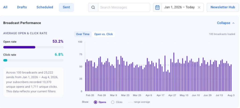
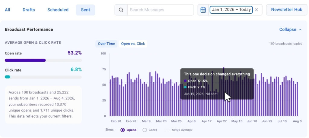
The Opens and Clicks Over Time chart plots up to 100 of your most recent broadcasts on a visual timeline. The toggle lets you switch between opens and clicks to compare performance across sends. A subject line that keeps drives opens, a send day with higher engagement than the rest. Patterns like these show up here fast.
Click-to-jump links any bar directly to that broadcast in the table below. From a spike in the chart to the exact message in seconds.
The chart loads automatically. As you scroll and load more broadcasts, they populate the bar chart.
See your strongest and weakest sends side by side
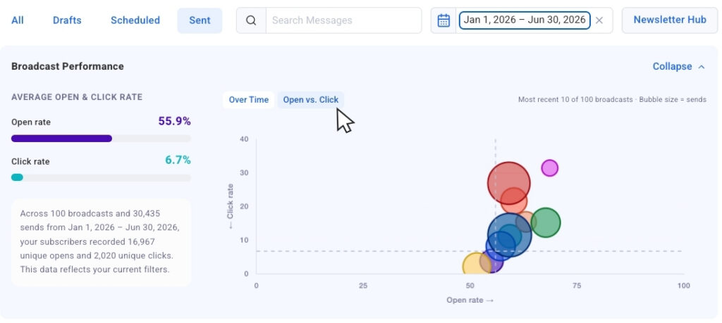
Switch to the Opens vs. Clicks bubble chart to see your most recent sends plotted together. Each broadcast appears as a bubble, sized by send volume, so you can compare results across different audience sizes without losing context.
Outliers surface fast here. You’ll see which broadcasts earned strong opens but fewer clicks, and which ones drove both. That tells you what to repeat and what to adjust.
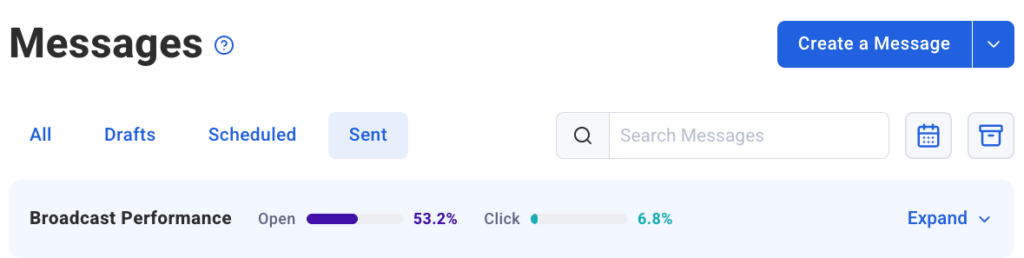
Collapsible chart view keeps the chart out of the way when you want to focus purely on the numbers in the table. Expand it again whenever you want the visual context back.
Filter down to exactly what you want to measure
Date presets let you pull the past 30 days, 90 days, or full year with one click. The chart updates immediately to show only those sends.
Dynamic search filtering goes further. Type in the search bar and the chart narrows to only broadcasts with that word in the subject line, so you’re comparing exactly the sends you care about.
Segment name filtering is coming soon too. You’ll be able to isolate chart and table data by segment, which matters since engagement naturally varies by audience.
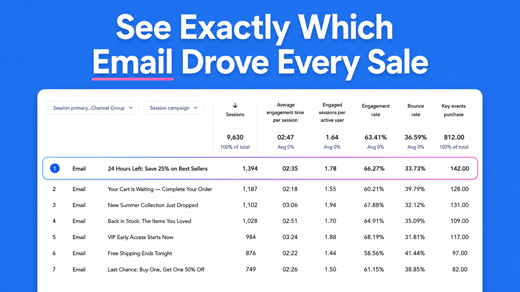
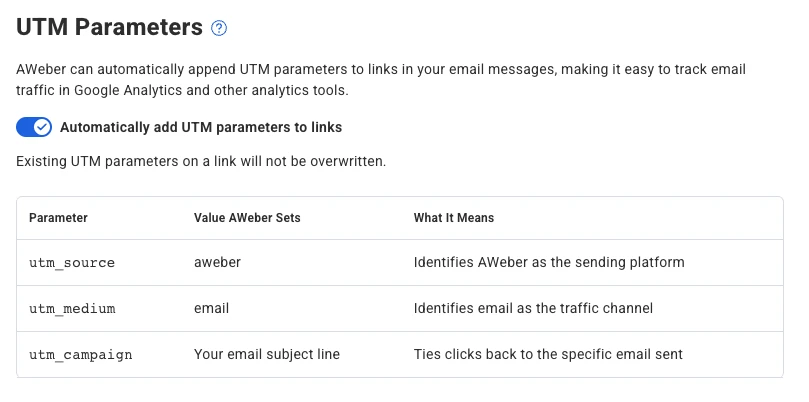
Send an email, get a click, make a sale. Now you can trace that sale back to the exact subject line that started it. AWeber automatically tags every link in every email with UTM parameters before your email goes out. Open Google Analytics and the data’s already waiting for you.
No manual setup.
Every link gets tagged automatically
AWeber adds three UTM parameters to every link at send time.
utm_source is set to aweber
utm_medium is set to email
utm_campaign is set to your email’s subject line
Each email gets its own campaign label in Google Analytics, named after its subject line. You can compare performance across sends without touching a single URL.
Already adding your own parameters? Yours stay put
AWeber detects existing UTM parameters and leaves them alone. If you’ve already tagged a link with your own campaign values, AWeber won’t overwrite them. Your custom tracking stays intact.
See which emails actually move people to buy
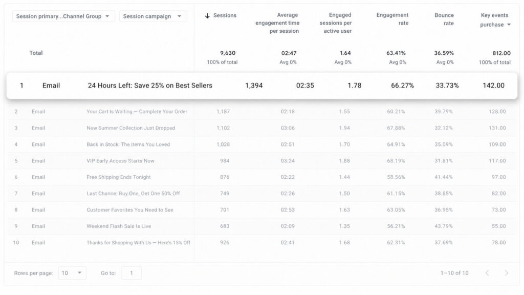
In Google Analytics, go to Acquisition > Traffic acquisition and filter by source/medium (aweber / email). Every email shows up as its own campaign.
Pull your last several sends. You’ll see which messages drove traffic, which drove conversions, and which fell flat.
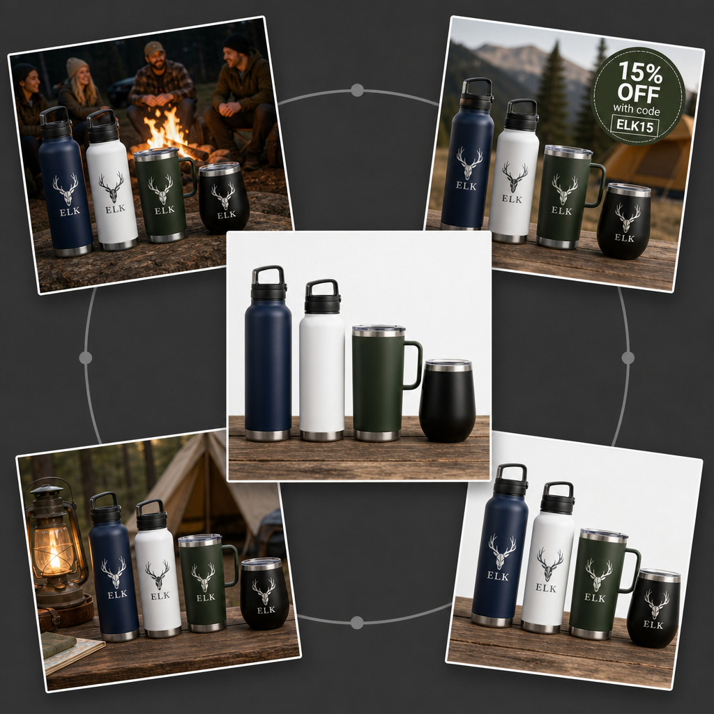
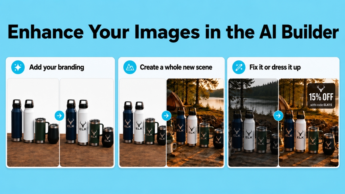
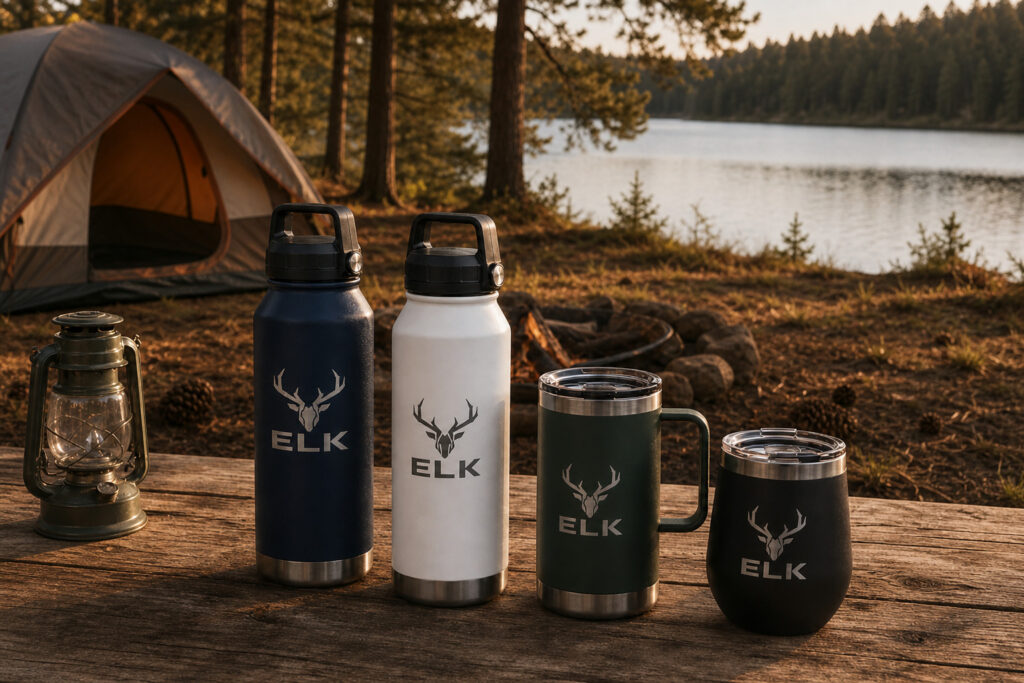
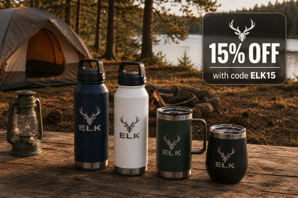
A single product shot can now become whatever the moment calls for. A different scene, your branding, a fixed flaw, a promotional overlay.
AWeber’s AI image editing is now live in the AI Signup Form Builder, and it’s coming soon to the AI Landing Page Builder and AI Email Builder.
Improve any image with a text prompt
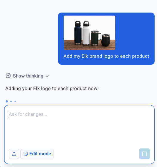
Add your branding
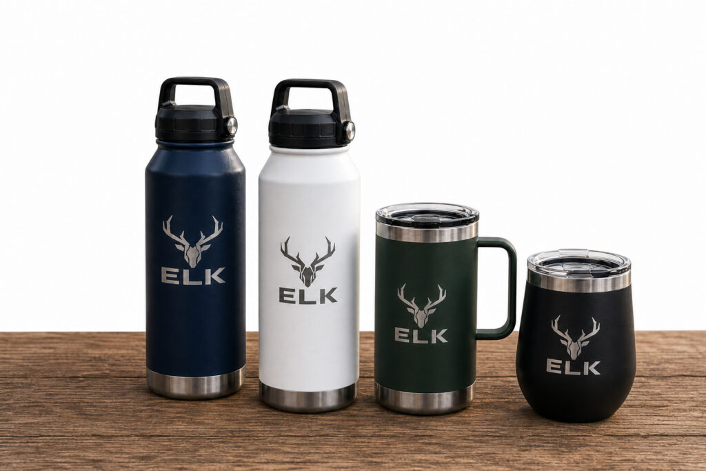
Stock photos and basic product shots rarely come with a logo already on them. Describe what you want added, and now they do.
Put your product in a scene it was never photographed in
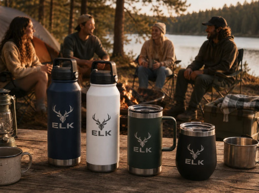
Take a plain studio shot and place it somewhere that sells the lifestyle: a campsite, a kitchen counter, a desk setup. Describe the scene, and the same product appears in it.
Fix what’s wrong with the photo
Bad lighting, a busy background, an awkward crop. Instead of redoing the shoot, describe the fix.
Add a text overlay that looks designed
Drop in a promo code, a callout, or a headline styled to match the scene, not just placed on top of it.
Each edit saves as its own file, and the original stays in the library too. So testing a new direction never means starting over if it doesn’t work.
How it works
1. Add an image to the AI Signup Form Builder
2. Describe the change you want
The more specific the prompt, the better the result.
Start with a brand-new image
Image generate skips the photo entirely. Describe what you want and the AI builds it from scratch.
Try it in your account now
This is live in the AI Signup Form Builder right now. It’s coming soon to the AI Landing Page Builder and AI Email Builder. too.
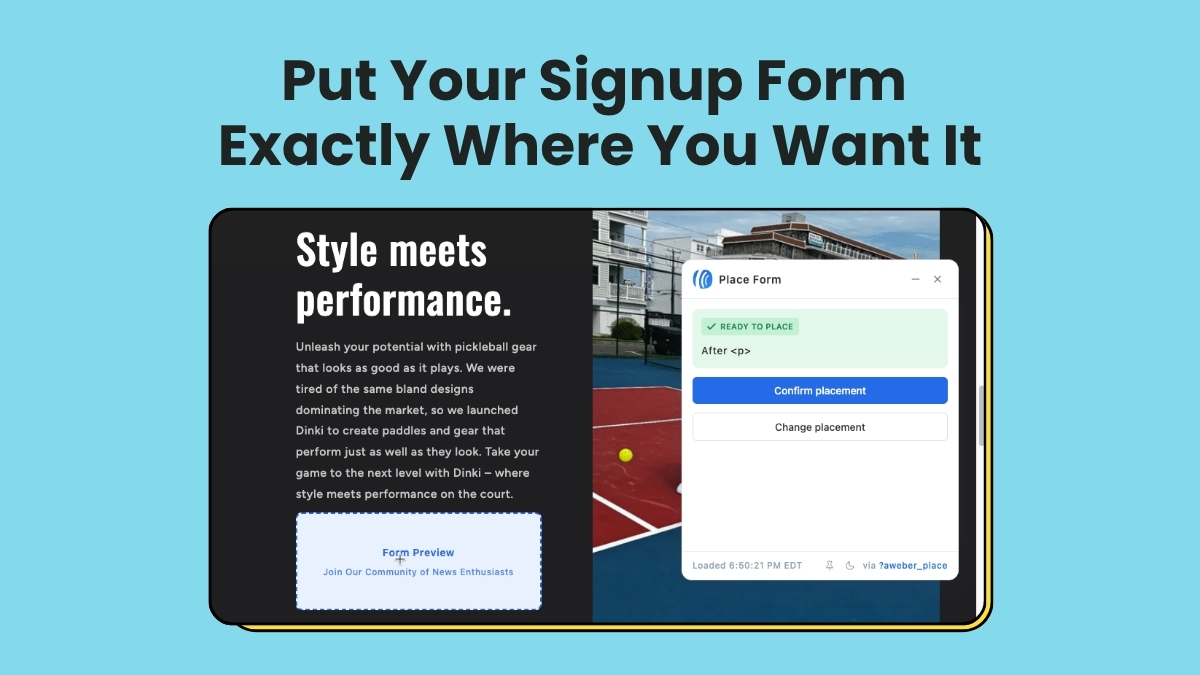
Where a signup form sits on your page changes who fills it out. A form embedded in your content catches someone mid-read, already interested. A form in a sidebar catches someone who’s scanning.
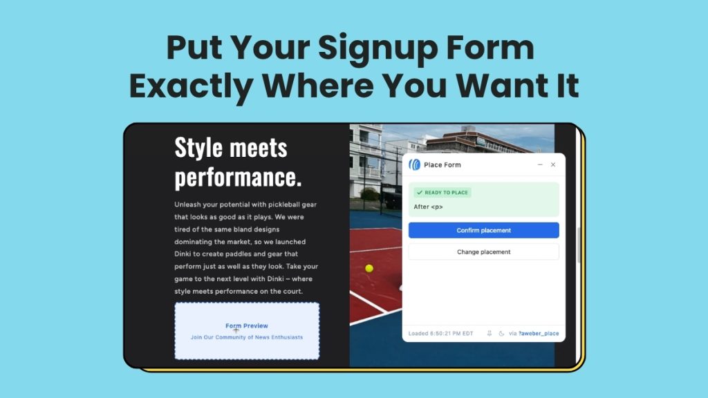
AWeber’s AI Signup Form Builder now creates inline forms and places them on your site visually. Pick the spot on your live page, confirm it, and the form is there. No code required.
{
“@context”: “https://schema.org”,
“@type”: “VideoObject”,
“name”: “Place an inline form anywhere on your website”,
“description”: “Place email signup forms anywhere on your site. No code needed.
AWeber’s visual form placement lets you drop inline signup forms exactly where you want them, just by clicking on your page. No editing HTML. No copying and pasting embed codes. Just point, confirm, and publish.
In this video, you’ll see how to:
1. Use the AWeber editor to build and customize your signup form
2. Open your live site directly from AWeber
3. Visually select where the form should appear
4. Publish in one click”,
“thumbnailUrl”: “https://img.youtube.com/vi/oPR7hE8oKMI/maxresdefault.jpg”,
“uploadDate”: “2026-06-24”,
“duration”: “PT1M0S”,
“contentUrl”: “https://www.youtube.com/watch?v=oPR7hE8oKMI”,
“embedUrl”: “https://www.youtube.com/embed/oPR7hE8oKMI”
}
Create your inline form in seconds
Three starting points, depending on how you like to work.
1. Custom prompt: Describe what you want and mention it’s an inline form for your site.
2. Fill-in-the-blanks: Answer a few prompts and select “embeds directly on my website” as your form type.
3. Template gallery: Browse the gallery and choose any inline template to start from.
All three start in the same form editor. Adjust your copy, design, and settings before you place anything.
Place it with four clicks
Once your form looks right, placing it takes four steps.
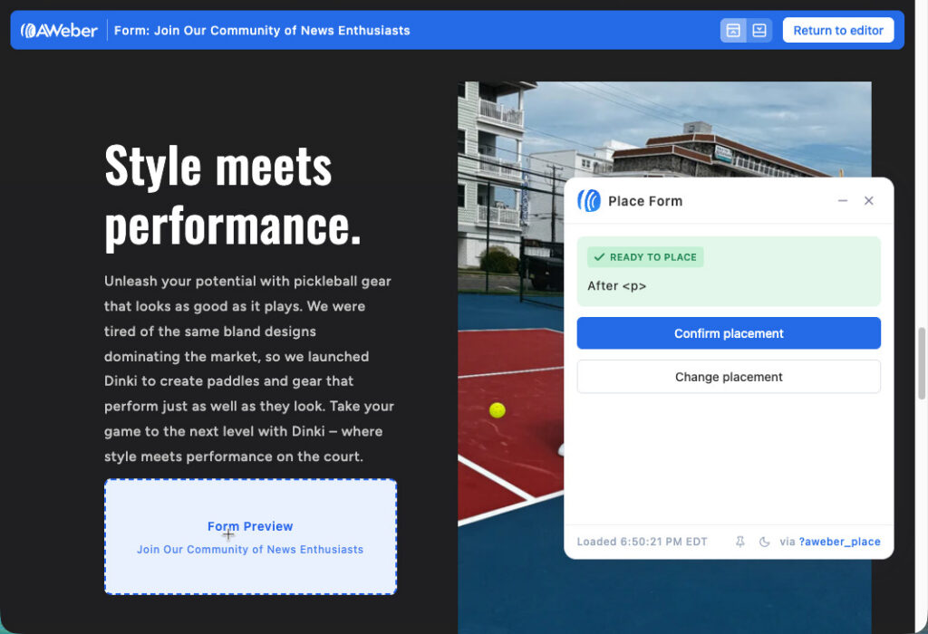
4. Your live site opens with the placement widget active. Click the section you want, then click “Confirm placement”
The placement widget shows your actual site, not a wireframe or a preview. You’re clicking a real location on your real pages. Then you click confirm, and the form is there.
Works on self-hosted sites
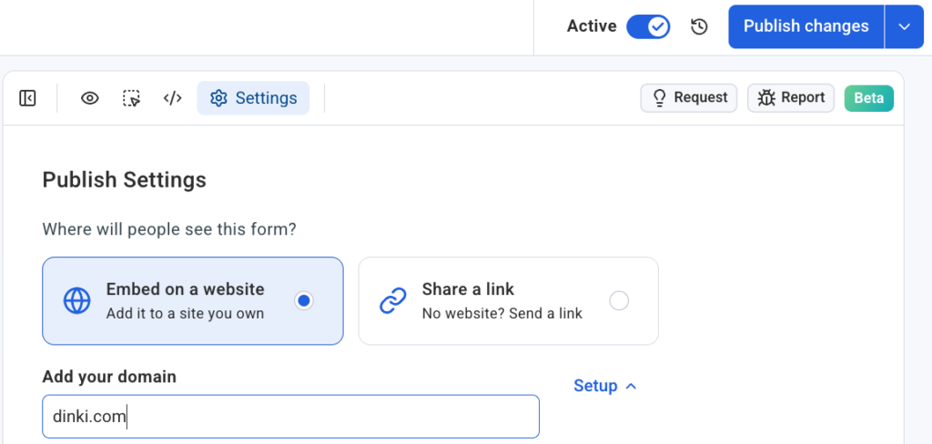
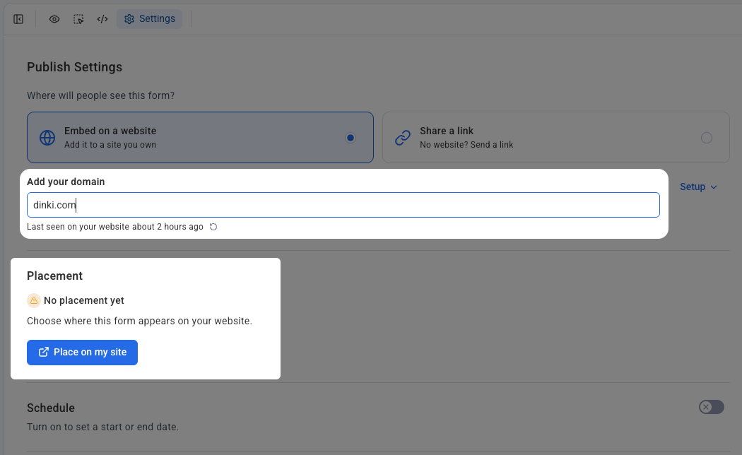
This works on self-hosted sites: WordPress, Shopify, Wix, Squarespace, Lovable, and more. Each domain connects independently in Settings. If you manage multiple sites or client accounts, each form connects to a specific domain and placements stay organized across properties.
Put your form where your readers already are
Your content is already bringing people in. An inline form turns that attention into subscribers, without sending anyone to a separate page or hoping they notice a sidebar. Open the AI Signup Form Builder, build your inline form, and place it exactly where it belongs.
A landing page is a standalone web page built for one goal: getting visitors to take a single action. No navigation. No distractions. Just one ask.
The type you build depends entirely on that ask. A page collecting email addresses is structured differently from a page selling a product. A page promoting a webinar needs different elements than one announcing a pre-launch. Choosing the wrong type is one of the most common reasons a landing page underperforms.
According to AWeber’s research, more than 90% of small business owners who use landing pages say they’re important or very important to their marketing strategy. The challenge isn’t whether to use them. It’s knowing which one to use and when.
New to landing pages? Start here: what is a landing page. Already know the basics? Keep reading for every type, what it does, and when to build one.
1. Webinar landing page
A webinar registration page promotes an upcoming event and collects sign-ups. It tells visitors what the webinar covers, who’s presenting, when it happens, and why it’s worth their time.
The most effective webinar pages lead with what the attendee will learn, not the presenter’s credentials. “You’ll walk away knowing exactly how to set up your first email automation” is more compelling than a speaker bio. Add credentials after you’ve made the case for attending.
Why it works
People register for webinars because of the outcome they expect, not the person delivering it. A registration page that leads with transformation rather than biography converts better because it answers the only question visitors are asking: what’s in it for me?
When to use it
When you’re hosting a live or recorded webinar and need a dedicated page to drive registrations. For more on driving sign-ups, see how to promote a webinar.
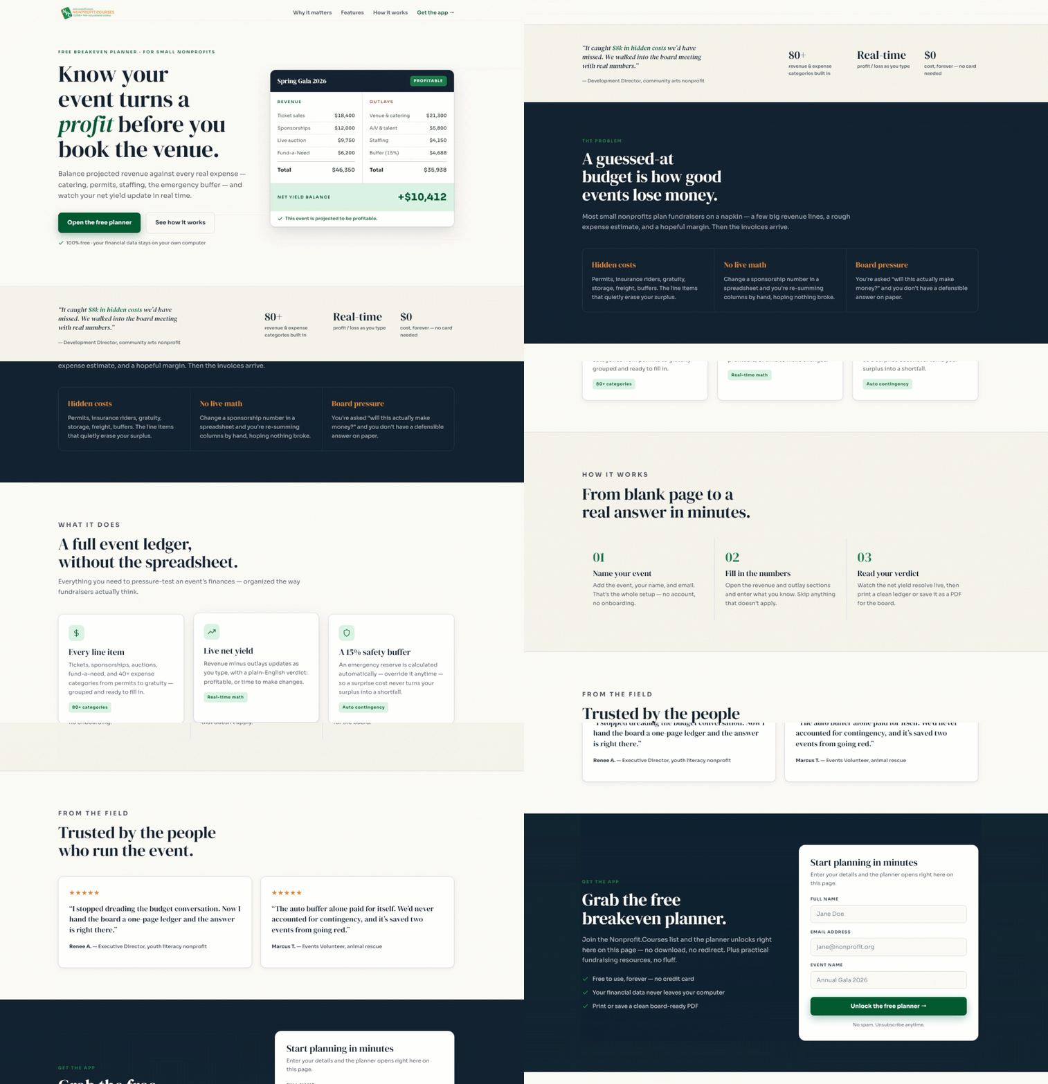
Webinar landing page example
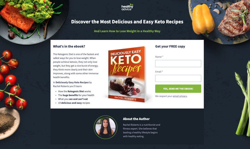
Ebook landing page
An ebook landing page is specifically created to promote and offer an electronic book (ebook). It serves as a destination where people can learn about the ebook’s content, benefits, and either purchase or download it.
When to use
Many aspiring entrepreneurs are looking to make money by selling ebooks online. By producing the ebook and selling it online, many business owners are bypassing the traditional publishers, print presses, and distribution centers.
Great explanation for what’s included in the ebook.
Action-oriented call to action – “Yes, Send me the ebook”.
Selling the value of the ebook with a strong headline.
About the author section helps add credibility regarding the contents of the ebook.
Visually appealing landing page background.
3. Ecommerce landing page
An ecommerce landing page focuses on a specific product or category. Unlike a full product catalog, it’s built to convert traffic from one specific source. A paid ad pointing to a dedicated ecommerce landing page typically converts at a higher rate than the same ad pointing to a homepage or general shop page.
These pages include product images, pricing, a clear CTA, social proof, and answers to common purchase questions.
Why it works
A homepage or product catalog gives visitors too many choices, which reduces conversion. An ecommerce landing page removes that optionality. One product, one offer, one action. That focus is what makes the conversion rate difference.
When to use it
When you’re running paid ads to sell a product, or when you want campaign traffic going to a page built for that campaign’s specific message rather than a generic shop.
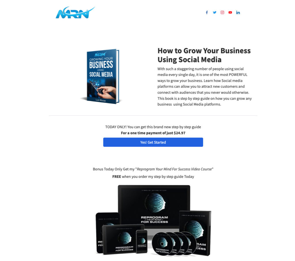
Ecommerce landing page example
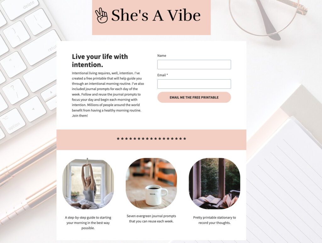
4. Lead magnet landing page
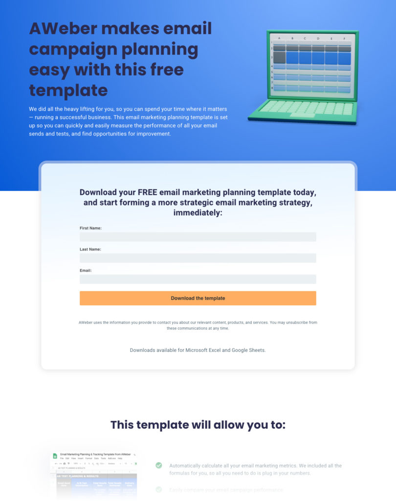
A lead magnet landing page offers a specific resource in exchange for an email address. The resource can be an ebook, a template, a checklist, a free course, a toolkit, or any downloadable that delivers immediate value.
Lead magnet pages differ from basic lead capture pages in that the content itself is the main draw. A strong lead magnet page leads with the outcome the visitor gets from the resource, not a description of the brand behind it.
Why it works
A lead magnet page converts because the offer does the work. When the resource solves a real problem your audience has right now, the email address feels like a fair exchange, not a barrier. The page doesn’t need to sell your brand. It needs to sell the value of what they’re getting.
When to use it
When you’ve created a resource your audience genuinely wants. Lead magnets are one of the fastest ways to build a list of people already interested in your topic. For ideas on what to offer, see lead magnet ideas to grow your email list.
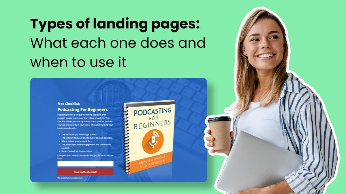
Three clear elements tell the visitor exactly what they’re getting before they submit their email. Simple and focused is what converts.
5. Squeeze page
A squeeze page is a stripped-down lead capture page. Its only job is to collect an email address. No long description, no detailed benefit list. Just a headline, one or two sentences, an email field, and a button.
Squeeze pages differ from standard lead capture pages in that they ask only for an email address, nothing else. The shorter and more focused the page, the less decision fatigue for the visitor.
Why it works
The minimal design removes every reason to hesitate. There’s one action and one field. Visitors either opt in or leave. That simplicity keeps cost per lead low when you’re running paid traffic.
When to use it
When you’re running paid ads and need to keep cost per lead down. Or when you want a fast, simple page to capture emails from a warm audience already familiar with you.
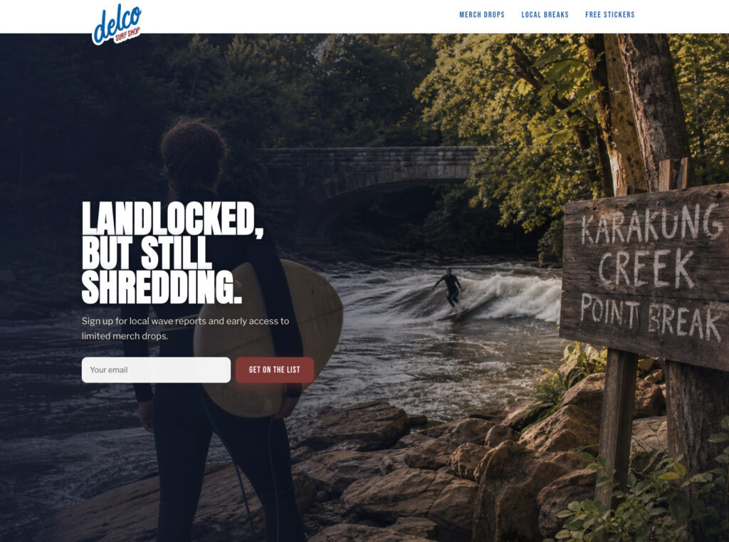
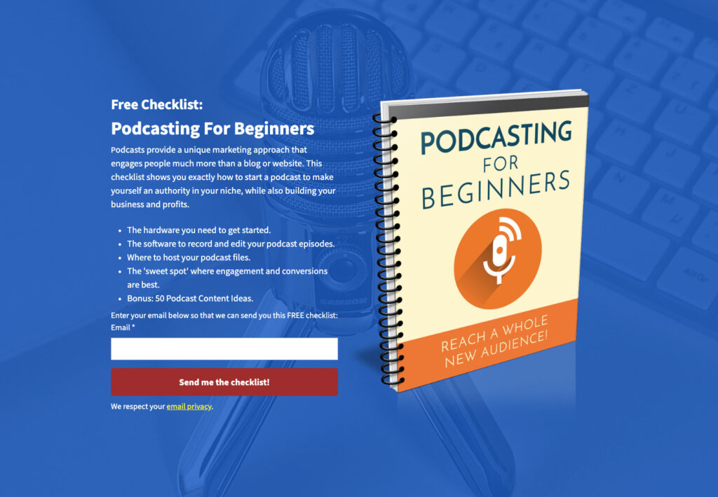
Squeeze page example
While this landing page example could also be considered a lead magnet landing page, this could also be considered a squeeze page do to the single email field request.
The single email field removes friction, the red CTA draws the eye to the one action on the page, and the background image connects visually to the offer.
6. Podcast landing page
A podcast landing page promotes a show or specific episode and gives listeners a way to subscribe or join an email list for updates.
Getting podcast listeners onto your email list matters because streaming platforms control distribution. You don’t own your audience on Spotify or Apple Podcasts. An email list gives you a direct line to listeners that no algorithm can disrupt.
Why it works
A podcast landing page does what the streaming platforms can’t: it converts a listener into a subscriber you own. Once someone is on your email list, you can tell them when a new episode drops, send bonus content, promote products, and reach them directly without relying on app notifications or platform visibility.
When to use it
When you’re growing a podcast and want to build a direct audience relationship beyond the streaming platforms.
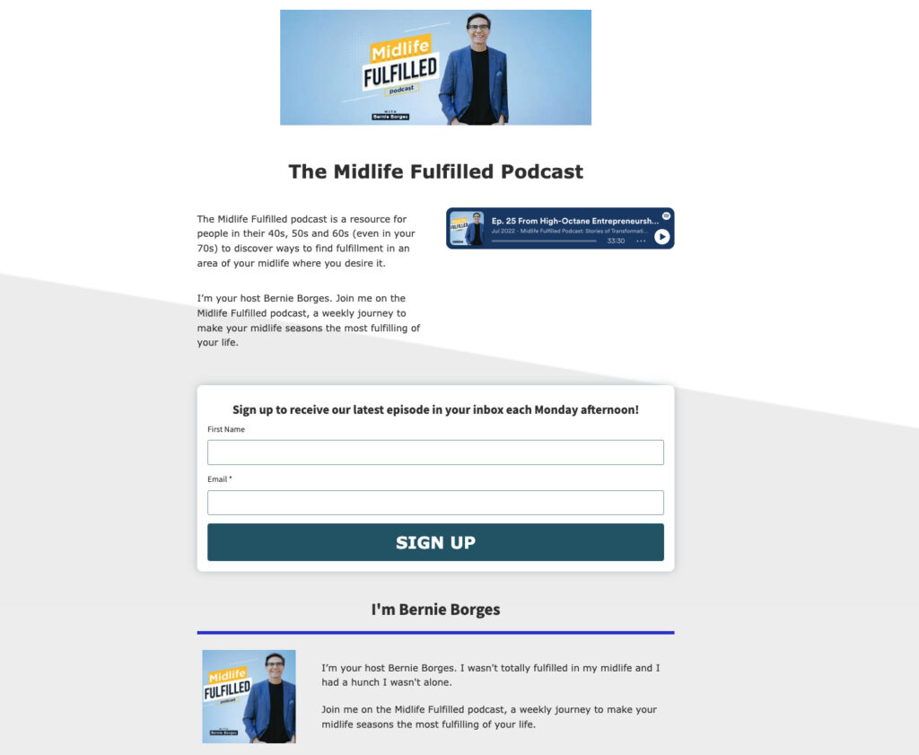
Podcast landing page example
The page sets clear expectations for email frequency after sign-up. An embedded episode lets visitors sample the show before committing their email address.
7. PPC landing page
A PPC (pay-per-click) landing page is built for paid search traffic. It’s designed to match the exact keyword or ad that brought the visitor to the page.
Message match matters more here than on any other type. If someone clicks an ad for “email newsletters for restaurants” and lands on a generic email marketing page, they’ll leave. Google’s Quality Score also rewards message alignment. Better-matched pages often cost less per click and rank higher in paid results.
Why it works
Paid traffic is expensive. Every visitor who lands on a page that doesn’t match what they clicked on is wasted spend. A PPC landing page protects that investment by giving visitors exactly what the ad promised. That relevance drives conversion and improves Quality Score at the same time.
When to use it
Every time you run paid search ads. Each ad group or keyword theme should have its own landing page, not a shared homepage.
PPC landing page example
The landing page mirrors the ad’s message exactly, keeping the visitor focused on the same offer that made them click.
8. Thank you page
A thank you page appears after someone completes a conversion. They signed up, downloaded something, or made a purchase. The page confirms what just happened and tells them what comes next.
Most thank you pages are underused. A visitor who just converted is more engaged than at any other point in the funnel. That’s the right moment to offer a related resource, invite them to book a call, or point them to a next step.
Why it works
The thank you page catches a visitor at peak engagement. They just took action, which means they’re already bought in. That momentum doesn’t have to stop. A well-designed thank you page turns a completed conversion into a second one, whether that’s an upsell, a follow, or a booking.
When to use it
After every form submission, purchase, or sign-up. Every conversion should land on a dedicated thank you page.
Thank you page example
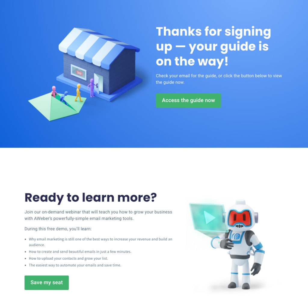
The page fulfills the lead magnet and immediately offers an upsell to an on-demand webinar, turning one conversion into a second.
9. Video landing page
A video landing page uses video as the primary way to deliver the page’s message. The video might be a product demonstration, a testimonial reel, or a short explainer. Text supports the video but doesn’t replace it.
Why it works
Seeing something in action removes hesitation in a way that written copy often can’t. Video builds trust faster than text, especially for offers that are hard to explain, high-ticket, or rely on personality and credibility. A visitor who watches a two-minute demo understands the product better than one who reads three paragraphs about it.
When to use it
When your offer is visual, when your audience responds well to video, or when you want to build a personal connection before asking for a conversion.
Video landing page example
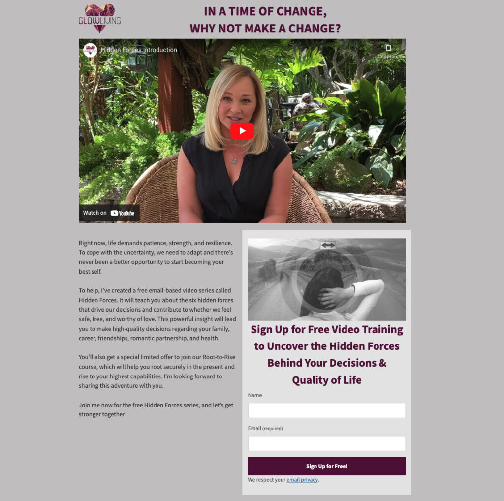
The video sits at the top center of the page, signaling it’s the most important element. The headline above the CTA states the benefit for signing up.
10. Link-in-bio landing page
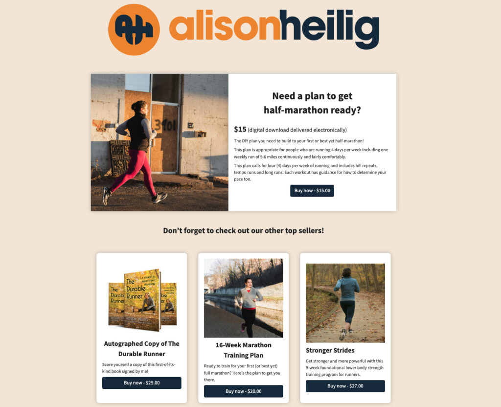
A link-in-bio page is a single page that holds multiple links. Social platforms typically allow only one clickable link in a profile bio. A link-in-bio page solves that by serving as a hub pointing to your newsletter, products, latest content, and booking page, all from one URL.
Why it works
Social media gives you reach but limits where you can send people. A link-in-bio page removes that constraint. Instead of choosing between linking to your newsletter or your latest product, you link to a page that holds both. Every follower who visits your bio gets access to everything you want them to see.
When to use it
When you’re active on platforms like Instagram, TikTok, or X and want one destination to send followers who want to take action.
Link-in-bio landing page example
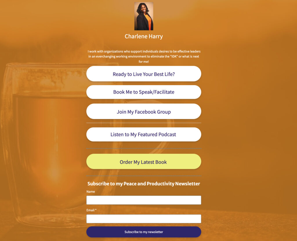
The CTA for the latest book uses a contrasting color, drawing the eye to the most important link on the page.
11. Pre-launch landing page
A pre-launch landing page builds interest before a product, service, or feature goes live. It collects email addresses from people who want to know when it launches, and it tests demand before you’ve committed to building.
If you can generate sign-ups before a product exists, you have early evidence that people want what you’re creating. If sign-ups are slow, that’s useful information too, before you’ve spent resources on the build.
Why it works
A pre-launch page does two things at once. It builds the audience you’ll market to on launch day and it validates the idea before you invest fully in it. A list of 500 people who opted in before launch is worth more than a list of 5,000 who signed up after, because those early subscribers told you they wanted it before it existed.
When to use it
Before any significant launch. A pre-launch page turns early interest into a list you can activate on day one.
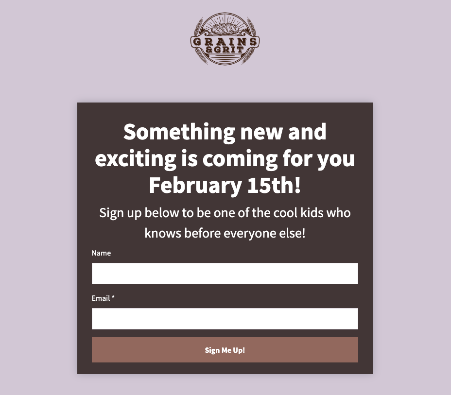
Pre-launch landing page example
12. Facebook landing page
A Facebook landing page is built for traffic coming from Facebook ads or a Facebook profile. Its purpose is to convert social followers into email subscribers or buyers.
You don’t own your Facebook audience. The platform controls who sees your content and can change that at any time. Moving followers onto an email list gives you a direct line to them that no algorithm can disrupt.
Why it works
Facebook reach is rented. Your email list is owned. A Facebook landing page is the bridge between the two. Every follower who converts to a subscriber becomes someone you can reach directly, regardless of what changes on the platform. Building your email list with Facebook is one of the highest-leverage ways to turn social reach into a durable audience asset.
When to use it
When running Facebook ads, or when you want to convert your following into a subscriber list you control.
Facebook landing page example
A lead magnet incentivizes followers to share their email. Examples of how the template can be used make the value of the offer concrete before the visitor signs up.
13. Lead capture landing page
A lead capture landing page collects contact information in exchange for something valuable. A free guide, a checklist, a discount, or access to a webinar. The visitor gets the resource. You get their email address.
Why it works
The page makes a direct trade. You’re not asking someone to buy yet. You’re asking them to share their contact information in exchange for something that helps them right now. The fewer fields you ask for, the higher your conversion rate. Name and email is usually enough to start.
When to use it
When your primary goal is growing your email list. Lead capture pages are the most reliable list-building tool for small businesses. If you want to grow your email list, knowing how to get email addresses the right way starts with a page like this one.
14. Click-through landing page
A click-through landing page doesn’t ask for anything upfront. Its job is to warm up the visitor and get them to click through to a purchase or sign-up page. No form. No transaction. Just information designed to build confidence before the next step.
These pages typically sit between an ad and a checkout page. They give visitors time to understand an offer without the pressure of an immediate decision. A free trial offer, a product walkthrough, or a feature comparison are common formats.
Why it works
Cold traffic rarely converts on a direct purchase page. A click-through page gives visitors a middle step where they can learn about what they’re considering without being asked to commit. By the time they reach the purchase page, they’ve already decided they’re interested.
When to use it
When your offer requires some explanation before someone is ready to buy. If paid traffic is cold and your purchase page has a high drop-off rate, a click-through page can close that gap.
How to choose the right type of landing page
The right landing page type follows directly from your goal.
If you want email subscribers: lead capture page, squeeze page, or lead magnet page. If you’re warming up cold traffic before a purchase: click-through page. If you’re selling directly: sales page for high-ticket offers, ecommerce page for products. If you’re promoting an event: webinar registration page or pre-launch page. If you’re running paid search: PPC landing page.
Start with one goal. Build one page for that goal. The most common reason a landing page underperforms is trying to accomplish too many things at once.
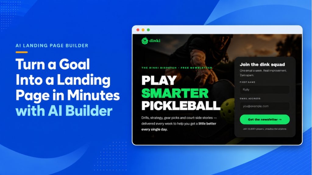
Build any type of landing page with AWeber’s AI Landing Page Builder
AWeber’s AI Landing Page Builder is coming soon, and it changes how fast you can go from idea to live.
Instead of picking a template and editing someone else’s design, you describe the page you want. Layout, copy, images, and your signup form. The AI builds the whole thing. Every subscriber goes directly to your AWeber list, ready to receive your welcome email.
It works for every type of landing page covered in this post. A lead magnet page for a free checklist, a webinar registration page for your next event, a pre-launch page for an upcoming product. Describe your offer and your goal. The AI handles the rest.
If you have a landing page you already like, upload a screenshot and the AI recreates it with your branding, copy, and offer. If you want to change an image, describe the change and the AI edits it directly. No stock photo hunting. No starting over.
Frequently asked questions about types of landing pages
What is the most common type of landing page?
Lead capture landing pages are the most widely used type. They collect a visitor’s contact information, usually in exchange for a free resource or offer. Because the conversion ask is low compared to a direct purchase, lead capture pages typically convert at higher rates and are used across nearly every industry and business type.
What is the difference between a squeeze page and a lead capture page?
A squeeze page and a lead capture page both collect email addresses, but they differ in length and complexity. A lead capture page includes more detail: a headline, benefit description, image of the offer, and a form. A squeeze page is stripped to the minimum. Just a headline, one or two lines of copy, an email field, and a button. Squeeze pages are typically used with paid traffic where keeping the page short lowers cost per lead.
What types of landing pages work best for building an email list?
The three most effective types for email list building are squeeze pages, lead capture pages, and lead magnet pages. Squeeze pages work well with paid traffic because low commitment keeps cost per lead down. Lead capture pages work across paid and organic traffic. Lead magnet pages work especially well when you have a specific resource, like a checklist, ebook, or template, that your audience actively wants.
{
“@context”: “https://schema.org”,
“@type”: “FAQPage”,
“mainEntity”: [
{
“@type”: “Question”,
“name”: “What is the most common type of landing page?”,
“acceptedAnswer”: {
“@type”: “Answer”,
“text”: “Lead capture landing pages are the most widely used type. They collect a visitor’s contact information, usually in exchange for a free resource or offer. Because the conversion ask is low compared to a direct purchase, lead capture pages typically convert at higher rates and are used across nearly every industry and business type.”
}
},
{
“@type”: “Question”,
“name”: “What is the difference between a squeeze page and a lead capture page?”,
“acceptedAnswer”: {
“@type”: “Answer”,
“text”: “A squeeze page and a lead capture page both collect email addresses, but they differ in length and complexity. A lead capture page includes more detail: a headline, benefit description, image of the offer, and a form. A squeeze page is stripped to the minimum. Just a headline, one or two lines of copy, an email field, and a button. Squeeze pages are typically used with paid traffic where keeping the page short lowers cost per lead.”
}
},
{
“@type”: “Question”,
“name”: “What types of landing pages work best for building an email list?”,
“acceptedAnswer”: {
“@type”: “Answer”,
“text”: “The three most effective types for email list building are squeeze pages, lead capture pages, and lead magnet pages. Squeeze pages work well with paid traffic because low commitment keeps cost per lead down. Lead capture pages work across paid and organic traffic. Lead magnet pages work especially well when you have a specific resource, like a checklist, ebook, or template, that your audience actively wants.”
}
}
]
}
“Do I need a website? What should I use a landing page for? Do I need both?”
If you’ve asked these questions, you’re not alone. Like all online small businesses, you want to set yourself up for success right away.
Carving out a place for your business on the internet is a great way to start building your audience. But there is more than one way to do it.
In this blog, I’ll share the similarities and differences between landing pages and websites, how to choose which is right for you, and how to get started.
Landing Page vs. Website: Definitions
What is a website?
A website is usually made up of five or more web pages, including:
Homepage
About page
Features, services, or products page
Blog
Contact page
And more, depending on the business, it’s goals, and audience
The goal of a website is exploration. Visitors browse, learn about you, get answers to their questions, and build familiarity with your business over time.
A website is your one-stop shop for everything about your business. But that completeness comes at a cost. Websites take more time, money, and upkeep than a single landing page.
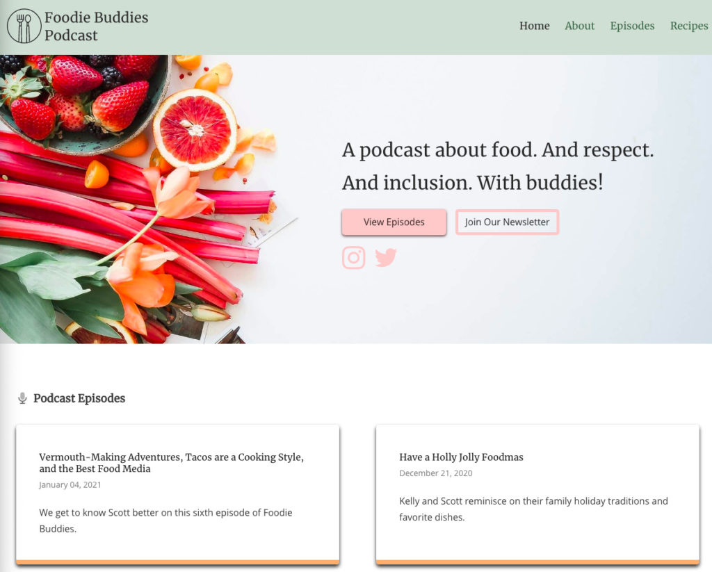
Check out the website for the podcast “Foodie Buddies” below. A visitor can easily navigate around the site to learn about the podcast, listen to the latest episodes, and get recipes.
What is a landing page?
A landing page is a standalone web page with one goal and one call to action. There’s no menu to click through and no other pages to wander off to. A visitor lands, reads, and either takes the action or leaves.
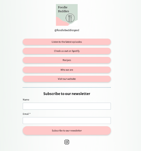
Acting as a link in bio page for your social profiles
Because everything on the page points to one action, landing pages convert better than pages built for browsing. The visitor never has to decide where to click next. You’ve already decided for them.
For a full breakdown of how landing pages work, with examples by type, see What is a landing page?
Remember the Foodie Buddies podcast website? Well, the podcasters also use landing pages as part of their marketing strategy.
In this case, the landing page is functioning as a link directory. This lets them use one link in their social media bios to easily direct followers to.
Landing page vs website: the differences side by side
Think of your website as a continent. Many pages, all connected, easy to travel between. A landing page is an island off the coast. It stands alone, and every visitor who arrives sees exactly one thing.
Here’s how they compare:
Landing page
Website
Number of pages
One
Five or more
Navigation
None or minimal
Full menu connecting every page
Goal
One specific action
Exploration and education
Calls to action
One
Many, spread across pages
Time to launch
Minutes to hours
Days to weeks
Cost
Low, often included with email tools
Higher: hosting, design, maintenance
Best for
Campaigns, list growth, selling one thing
Established businesses with lots to show
The structural difference matters less than the behavioral one. A landing page asks your visitor to do one thing. A website invites them to look around.
When to use a landing page
Use a landing page when you want focus. If you’re running an ad, promoting a lead magnet, launching a product, or sharing one link on social media, a landing page keeps your visitor on task.
Landing pages also make sense when you want to test an idea before investing in it. You can build a page for a new offer in an afternoon, send traffic to it, and find out if anyone wants it before you spend a dollar on a full site.
And if you’re just starting out, a landing page gets you online today. No designer, no developer, no monthly hosting bill.
When to use a website
Use a website when your business has enough depth that one page can’t hold it. Multiple product lines, a content library, a portfolio, a team page. If visitors regularly need answers to different questions, a website gives each answer its own home.
A website also builds long-term search visibility. A blog with helpful content brings in visitors month after month, something a single landing page rarely does on its own.
One isn’t a replacement for the other, though. Even with a full website, landing pages still do the conversion work. Send your ad traffic and email promotions to focused landing pages, not your homepage. Your homepage has too many exits.
How to decide which one you need
Ask yourself four questions:
1. What do I want visitors to do? One specific action means landing page. Explore and learn means website.
2. Do I have the time and budget for a website right now? If not, start with a landing page. You can add a website later.
3. Am I testing an idea? Validate with a landing page first. Build the website once the idea proves itself.
4. Does my business have enough content to fill five pages? If you’d be padding pages just to have them, you’re not ready for a website. That’s fine.
Can you run a business on landing pages alone?
Yes. Plenty of creators, coaches, and solo businesses operate entirely on landing pages. One page to collect email signups. One to sell a digital product. One as a link in bio hub.
Email makes this work. Your landing page captures the subscriber, and your emails handle everything a website would normally do: education, trust-building, promotion. The list becomes the asset. The landing page is just the front door.
You can build that front door without a website, hosting, or code. With AWeber, you pick a template based on your goal, customize it with a drag-and-drop editor, and publish with hosting and a secure connection included. An AI-powered content creator helps you write headlines and copy, and a built-in Canva editor lets you design graphics without leaving the page. You can collect payments directly on the page, too.
Every signup flows straight into your email list, so the moment someone subscribes, your welcome email is already on its way.
Landing page vs website FAQ
What is the difference between a landing page and a website?
A landing page is a single standalone page designed to drive one action, like an email signup or a purchase. A website is a collection of connected pages designed for browsing and learning. Landing pages have one call to action and little or no navigation. Websites have full menus and many goals.
What is the difference between a microsite and a landing page?
A microsite is a small cluster of pages, usually two to five, built for a specific campaign, product, or event. It sits separate from a company’s main website and often has its own domain. A landing page is smaller still: one page, one call to action. Use a microsite when a campaign needs multiple pages of content. Use a landing page when you need one focused conversion point.
Do you need a website if you have a landing page?
No. A landing page works on its own. You can grow an email list, sell products, and run a business from landing pages without ever building a website. Many businesses start with a landing page and add a website later, once they have more content and offerings to showcase.
Is a landing page cheaper than a website?
Yes, in most cases. A custom website can cost thousands of dollars in design and development, plus ongoing hosting and maintenance. A landing page is often included with tools you already pay for. AWeber includes landing pages with hosting and SSL on every plan.
Can a landing page replace a homepage?
For a new or small business, yes. If your business does one thing, a landing page focused on that one thing often converts better than a traditional homepage. As your business grows and visitors need more information, a homepage with navigation becomes more useful.
{
“@context”: “https://schema.org”,
“@type”: “FAQPage”,
“mainEntity”: [
{
“@type”: “Question”,
“name”: “What is the difference between a landing page and a website?”,
“acceptedAnswer”: {
“@type”: “Answer”,
“text”: “A landing page is a single standalone page designed to drive one action, like an email signup or a purchase. A website is a collection of connected pages designed for browsing and learning. Landing pages have one call to action and little or no navigation. Websites have full menus and many goals.”
}
},
{
“@type”: “Question”,
“name”: “What is the difference between a microsite and a landing page?”,
“acceptedAnswer”: {
“@type”: “Answer”,
“text”: “A microsite is a small cluster of pages, usually two to five, built for a specific campaign, product, or event. It sits separate from a company’s main website and often has its own domain. A landing page is smaller still: one page, one call to action. Use a microsite when a campaign needs multiple pages of content. Use a landing page when you need one focused conversion point.”
}
},
{
“@type”: “Question”,
“name”: “Do you need a website if you have a landing page?”,
“acceptedAnswer”: {
“@type”: “Answer”,
“text”: “No. A landing page works on its own. You can grow an email list, sell products, and run a business from landing pages without ever building a website. Many businesses start with a landing page and add a website later, once they have more content and offerings to showcase.”
}
},
{
“@type”: “Question”,
“name”: “Is a landing page cheaper than a website?”,
“acceptedAnswer”: {
“@type”: “Answer”,
“text”: “Yes, in most cases. A custom website can cost thousands of dollars in design and development, plus ongoing hosting and maintenance. A landing page is often included with tools you already pay for. AWeber includes landing pages with hosting and SSL on every plan.”
}
},
{
“@type”: “Question”,
“name”: “Can a landing page replace a homepage?”,
“acceptedAnswer”: {
“@type”: “Answer”,
“text”: “For a new or small business, yes. If your business does one thing, a landing page focused on that one thing often converts better than a traditional homepage. As your business grows and visitors need more information, a homepage with navigation becomes more useful.”
}
}
]
}
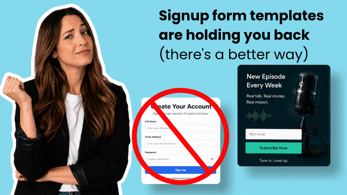
A signup form template sounds like a shortcut. It isn’t.
You browse a gallery, pick the closest match, then spend the next hour adjusting fields, rewriting the headline, swapping colors, and rearranging the layout until it looks like something that belongs to your business. You started from someone else’s form and worked backward.
AI form builders, like AWeber’s AI Signup Form Builder, change that. Describe what you need, upload a screenshot of a design you like, or answer a few prompts. You get a form built for your specific business from the start. No template hunting. No generic copy to overwrite.
What’s wrong with signup form templates
Templates are built to work for as many people as possible. That’s exactly what makes them a poor fit for you.
Every template ships with a generic headline, a default field set, and a layout optimized for nobody in particular. You get “Subscribe to our newsletter” when your offer is a free five-day email course on dog training. You get three fields when you only need one. You get a two-column layout when your brand is minimal.
The gap between “template” and “your actual form” requires real work. Copywriting, design decisions, field logic. By the time the form looks right, you’ve spent more time customizing than you would have starting from scratch with a clear prompt.
There’s another problem: templates anchor your thinking. You start with someone else’s structure and adapt around it. That’s a different creative process than building for your audience from the ground up.
A bettter way: AI Signup Form Builder
An AI Signup Form Builder starts with you, not a template gallery.
To give you an idea of how they work, we’ll use AWeber’s as an example.
You have three core ways to create forms:
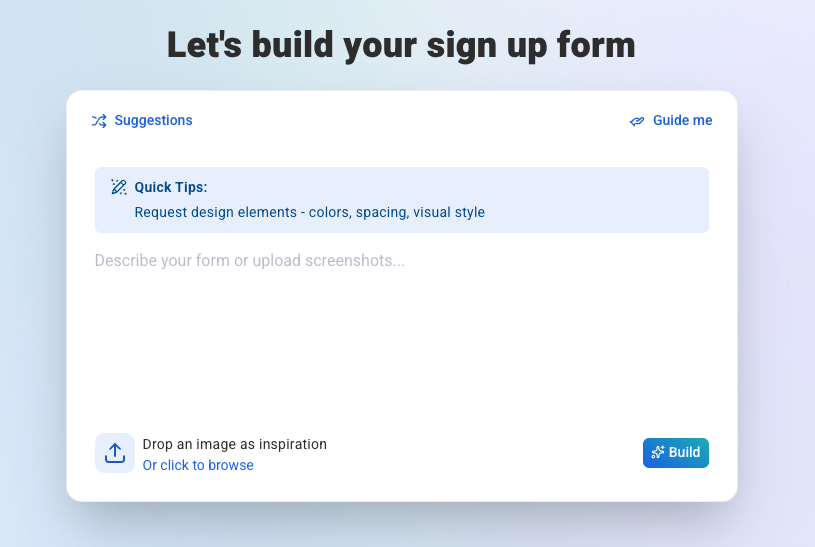
1. Describe it
Type what you need in plain language. “A simple one-field form for a free guide on meal planning for busy parents.” The builder generates a form matched to that description: relevant headline, appropriate fields, copy that fits the offer.
2. Upload a screenshot
Found a form you like somewhere online? Upload a screenshot. The builder reads the design, takes cues from the layout and structure, then produces a version customized to your brand. You’re not locked into copying it. You’re using it as creative inspiration without the manual rebuild.
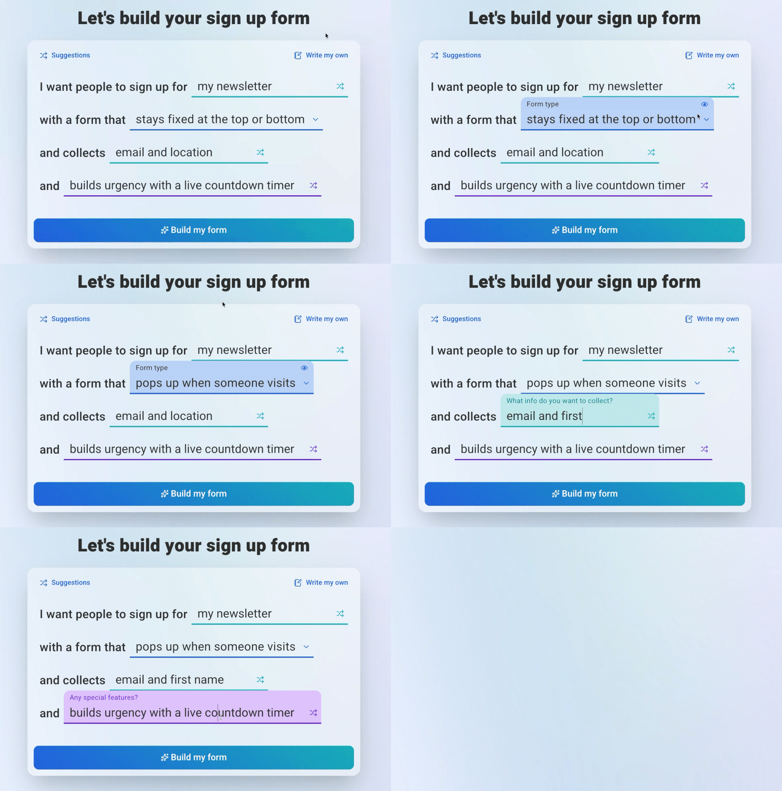
3. Use guided prompts
Answer a few questions about your audience, offer, and goals. The builder assembles a form from your answers. Specific inputs produce specific output.
After the initial build, you refine through conversation. Tell it to shorten the headline, add a checkbox, change the button text. The form updates without you touching a field editor. Each change happens in plain language, not a settings panel.
Look at the comparison of an AI form builder using AWeber versus a drag and drop builder. The speed and quality of a form created using the AI Form Builder is unmatched.
{
“@context”: “https://schema.org”,
“@type”: “VideoObject”,
“name”: “AWeber AI Signup Form Builder vs Mailchimp: A Baseball Form Built in 93 Seconds”,
“description”: “AWeber’s AI Signup Form Builder goes head-to-head with Mailchimp. Same brand, same challenge: build a signup form for WalkUp Hero that feels like stepping up to the plate before the big swing.
One builder has AI. The other still works the old way, with a classic drag-and-drop editor. AWeber finished in 93 seconds, then we pushed it further into baseball-card nostalgia, walk-up music, and visuals you have to see to believe. Watch both builds side by side and decide for yourself.
This is Form & Function, AWeber’s series putting AI signup form building up against the tools you already know.”,
“thumbnailUrl”: “https://img.youtube.com/vi/WT6xMD95tJI/maxresdefault.jpg”,
“uploadDate”: “2026-06-01”,
“duration”: “PT1M27S”,
“contentUrl”: “https://www.youtube.com/watch?v=WT6xMD95tJI”,
“embedUrl”: “https://www.youtube.com/embed/WT6xMD95tJI”
}
What you actually get versus a template gallery
With a template gallery, you’re choosing from a fixed set of options. The form that fits your brand may not exist yet. If it doesn’t, you’re compromising.
With the AI builder, there’s no fixed set. The form is generated from your inputs. That means the headline matches your offer, the field count matches your ask, and the copy sounds like your brand rather than a product demo.
Take this example: A fitness coach needs different copy and a different feel than a B2B SaaS tool. A template gallery serves both of them the same starting point. The AI builder starts from the description you give it.
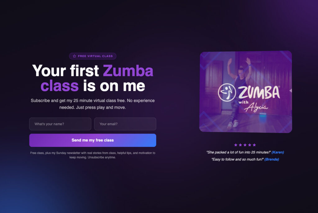
Watch how Alycia using Stu McLaren’s brand as inspiration to create a custom form using the AI Signup Form Builder in AWeber.
When a template can still be useful
Templates aren’t useless. They’re useful in a specific way: inspiration.
If you’ve seen a form that stopped you mid-scroll, that’s worth saving. The layout, the CTA, the field structure. Not to copy, but to understand what caught your attention.
That’s where the screenshot feature earns its keep. Grab a screenshot of any form that inspires you, upload it to the AI Signup Form Builder, and describe your business. The builder takes the structural cues from the design you liked and applies them to a form that belongs to you.
You get the inspiration without the imitation. The creative shortcut without the brand mismatch.
Build your first form in minutes
Open AWeber, select the AI Signup Form Builder, and type one sentence describing your offer. That’s the starting point. No template browsing, no layout compromises, no copy you have to overwrite.
The form is ready when you are. And the subscribers it collects will get your welcome email the moment they sign up.