
Have you ever landed on a website so intuitive it felt like it was reading your mind? Or use an app so seamless it felt like an extension of your own hands? That’s the power of exceptional user experience (UX) design—and, trust me, it’s no accident.
Let’s flip the coin for a moment. Consider the frustration of a clunky website or a confusing app. You click away, don’t you? Your customers do too, and they might never return.
The truth is a great UX can be the wind in your brand’s sails, propelling you forward with each satisfied customer. Meanwhile, poor UX can anchor you down, holding you back from achieving your true potential. So, how can we ensure we’re harnessing this wind without being dragged down by the anchor?
In this article, we’ll navigate the sea of UX design together. I’ll review user experience best practices that lead to seamless digital experiences and boost your conversions. So, are you ready to set sail and transform your user experience? Let’s get started.
Why User Experience Matters
If you’re asking yourself, “Why does user experience matter?” you’re asking the right question. UX is not only important but crucial to your success.
UX design is about creating a seamless, intuitive interaction between users and your digital platforms, whether a website, app, or online store. UX isn’t about making your site look pretty—it’s about understanding your users’ behavior, needs, and motivations.
When you nail UX, your users not only visit your site—they enjoy it. They find the information they need quickly and enjoy the journey you’ve laid out. They are far more likely to convert, whether that means signing up for a newsletter, making a purchase, or sharing your content.
On the flip side, poor UX is a silent brand killer. It creates friction, causing users to leave your site and increasing your bounce rate. Plus, it can tarnish your brand image, making users less likely to return in the future.
Investing in UX isn’t just a nice-to-have anymore—it’s a must-have. Your users demand it, and in today’s competitive digital landscape, delivering anything less could cost you valuable conversions.
11 UX Best Practices
Crafting an impressive user experience isn’t a matter of guesswork. Let’s dive into the 11 UX best practices to increase customer satisfaction and, ultimately, conversions.
Know Your Target Audience
Your website UX design should start by knowing who your users are, their preferences, and what motivates them. Collect data about their demographics, behaviors, needs, and pain points. User surveys, analytics, and creating user personas are powerful tools in this regard.
For example, if your target audience is millennials, they might appreciate a website design that’s aesthetically modern, minimalistic, and mobile-friendly. This is because they tend to be tech-savvy, appreciate good design, and frequently use mobile devices. Adjust your website user experience best practices accordingly and you’ll stand a far better chance of connecting with that audience.
Understanding your audience’s behavior and expectations allows you to personalize the user experience to meet their needs. Personalization can range from product recommendations based on browsing history to personalized emails.
Subscription-based healthy food retailer Thrive Market is a force at personalization, providing tailored shopping experiences—and even customized grocery lists—through its on-site onboarding quiz and progressive profiling. Not only do users feel understood, but this seamless experience takes some of the work off users’ plates.
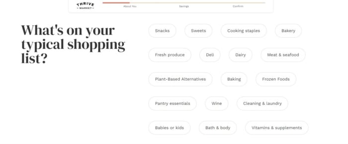
Source: Thrive Market
By taking the effort out of shopping, Thrive increases the likelihood of sales. That’s a win-win for the brand and the user.
Keep Things Simple
Simplicity is key in UX design. Users prefer intuitive interfaces that make it easy to find what they need without any unnecessary complexities. In fact, 88 percent of online users are less likely to return to a site after a bad experience.
A clutter-free, clean design with well-organized elements and plenty of white space significantly enhances the user’s experience. This isn’t just about aesthetics but about creating an intuitive path that guides users to what they’re looking for.

Source: Apple
Take Apple’s website—it’s a prime example of a simple yet effective design. Plenty of white space, a simple color scheme, clean lines, and an intuitive layout make it easy for users to find what they want. This kind of design takes the effort out of finding what you want.
Apple lays out its products using sharp, striking imagery and big, bold text, taking care not to cram too much onto the page and overwhelm the user. There’s little room for confusion as you scroll your way down the page. Each product description features minimal text and straightforward calls-to-action (CTAs)—“Learn more” and “Buy.”

If a minimalist, intuitive design is a fit for your target audience, use Apple as inspiration for your website and mobile UX best practices.
Use Clear Navigation
Clear navigation is crucial in guiding users through your website and helping them find what they need. Some suggest following the three-click rule: users should be able to find what they’re looking for within three clicks. Anything more can frustrate them and increase their chances of leaving your site. To ensure this:
- Group similar pages under descriptive menu items
- Provide clear CTAs
- Offer a robust search feature

Source: Best Buy
An excellent example of enhancing user experience in website architecture is the breadcrumb navigation on Best Buy’s website. Breadcrumb navigation tells you what pages you’ve visited and how you got where you are.
These navigational aids make it easy for you to bounce back and forth between pages without getting lost. These little details can significantly enhance the user’s experience, making your website more user-friendly.
Design Hierarchy
Visual hierarchy is the principle of arranging elements to signify importance. This means using techniques like size, color, and placement to first direct the user’s attention to the most important elements. This is crucial in helping users navigate your site and understand where to focus their attention. A good visual hierarchy guides users intuitively through the content, enhancing readability and comprehension.

Source: Netflix
Take Netflix, for example. On their homepage, the “Play” and “More Info” buttons on the featured movie stand out due to their large size and central placement. This draws the viewer’s attention and encourages them to interact, thereby enhancing the user experience.
Make It Accessible
In the digital world, accessibility is synonymous with inclusivity. Ensure that your website or app is fully functional and easily navigable by people with disabilities. This includes using high-contrast color combinations for those with visual impairments and providing alt text for images for those using screen readers. Incorporating these features enhances the user experience for everyone and helps broaden your user base.
Future of work publication Collective Thoughts does a great job of incorporating accessibility seamlessly into its website. From thought leadership articles to product roundups, there is an easy-to-find audio version of every piece, helping enhance every user’s experience.
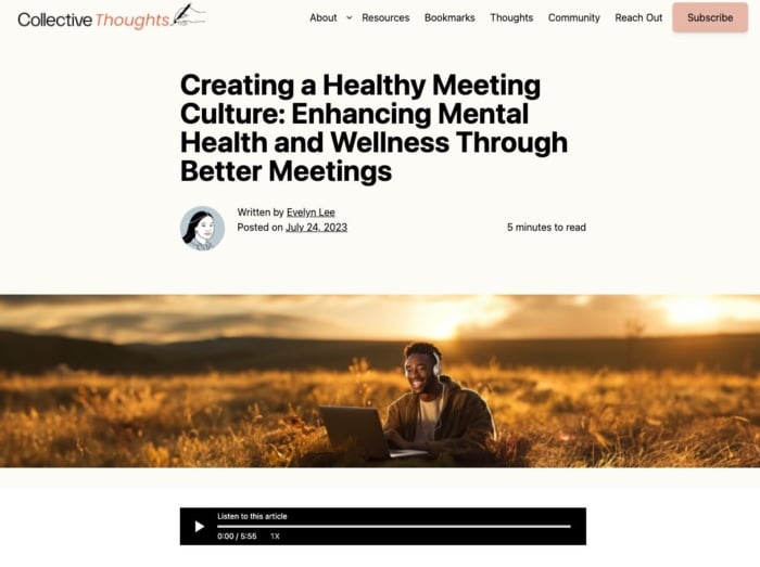
Source: Collective Thoughts
For guidelines on accessibility, you can refer to the World Wide Web Consortium’s (W3C) Web Content Accessibility Guidelines (WCAG). They provide a detailed list of recommendations for making web content more accessible to people with disabilities. Prioritizing accessibility helps you reach a broader audience and demonstrates your brand’s commitment to inclusivity.
Streamline Forms and Checkouts
Reducing friction in your forms and checkout process can significantly enhance the user experience. We’ve all added an item to an online shopping cart and then gone to check out, only to give up after realizing there are about 20 fields of information to click through and fill out.
OK, I might be exaggerating a little, but over-the-top checkout processes are a real problem. I’m not the only one who thinks so. A Stripe survey finds that 60 percent of shoppers say they’ll abandon their cart if a checkout takes more than two minutes.
So, how should you optimize your checkout process? Some possible e-commerce UX best practices to implement include:
- Keeping forms as short as possible
- Asking only for necessary information
- Providing clear, descriptive labels for each field
- Offering features like auto-fill for returning users or guest checkout options can speed up the process and reduce the chances of cart abandonment
- Offering flexible payment options, including third-party payment methods like PayPal and Apple Pay
- Offer guest checkout options so users can forgo the time-consuming process of signing up for an account

Source: Amazon
Amazon has mastered the art of the streamlined checkout process with its patented “1-Click” ordering system. With just a single click, a user can process their purchase using their default payment and shipping details, bypassing the typical multi-step checkout process.
That level of efficiency can significantly enhance the user experience, fostering customer loyalty and increasing the likelihood of repeat purchases.
Revisiting the Stripe survey, 75 percent of customers are more likely to follow through on a purchase if a site offers one-click checkout. Despite that eye-popping stat, only 40 percent of sites actually provide a one-click checkout experience. That’s a big opportunity for you.
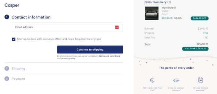
Another helpful UX best practice is providing customers with a visualization of the checkout process. Mattress company Casper does this well, clearly mapping out checkout steps when you go to finalize a purchase.
Showing users where they’re at in the checkout flow and what’s next creates a transparent experience. This keeps users informed and gives them a sense of control and anticipation, contributing to a smoother, more satisfying user experience.
Don’t Forget About Mobile
With more than 5 billion people accessing the internet via mobile devices, a mobile-optimized website is no longer just an option. It’s a necessity.
It’s critical that your website is responsive and automatically adjusts its layout based on the user’s device. Additionally, user interface elements like buttons and links should be large enough to tap easily on a smaller screen.
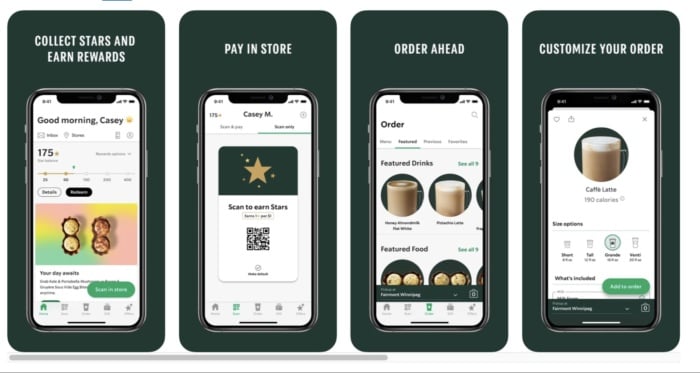
Source: Indigo 9 Digital
Starbucks offers a seamless mobile experience. From their responsive design to their easy-to-use mobile ordering system, they’ve designed their mobile experience with their users’ needs in mind. In the mobile internet era, a mobile-friendly design is critical to your brand’s online success.
Use Product Filters and Site Search
Especially important for e-commerce websites, product filters, and a robust site search function can greatly enhance the user experience. Filters enable users to narrow down their options based on their specific needs or preferences, making it much easier for them to find exactly what they’re looking for.
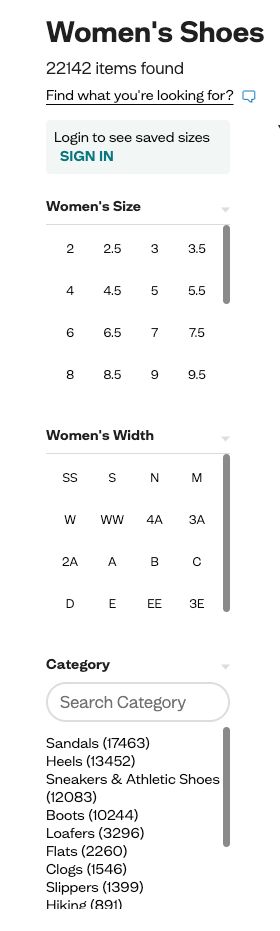
Source: Zappos
Zappos, a leading online shoe retailer, does an excellent job with this. They provide filters for categories such as size, color, price range, and brand, allowing users to easily find their perfect pair of shoes. When combined with a powerful site search, these tools can greatly improve your site’s usability, creating a more pleasant and efficient user experience.
Communicate Outcomes of Proposed Actions
Clarity is key in UX design. Make sure to communicate the outcomes of proposed actions to users. If a form submission will lead to a confirmation email, tell them.
Word things as clearly as possible and avoid ambiguous phrasing. Users should know precisely what comes next after clicking on a CTA. Stick to tried and true CTAs like “Buy Now” and “Add to Cart.” They’re staples of e-commerce checkout processes across the internet, the former launching you straight into the purchase process and the latter enabling you to place an item in your cart as you continue browsing a site’s inventory.
Simplicity and transparency build trust with users. They know exactly what to expect from their actions, which reduces uncertainty and anxiety. By communicating the outcomes of proposed actions, you’re respecting the user’s autonomy and providing them with a sense of control, which leads to a better user experience.
Set Goals and Guide Users There
In UX design, each element on your site should serve a purpose. Your design should guide users toward specific goals, whether it’s subscribing to a newsletter, making a purchase, or downloading a resource. The path to achieving these goals should be clear and straightforward.

Source: Dropbox
Dropbox provides a clear example of this. Its homepage features a prominent “Find your plan” button, which is hard to miss. This clear call-to-action guides users toward their primary goal—getting more sign-ups. A clear, focused path not only enhances the user experience but also improves your conversion rates.
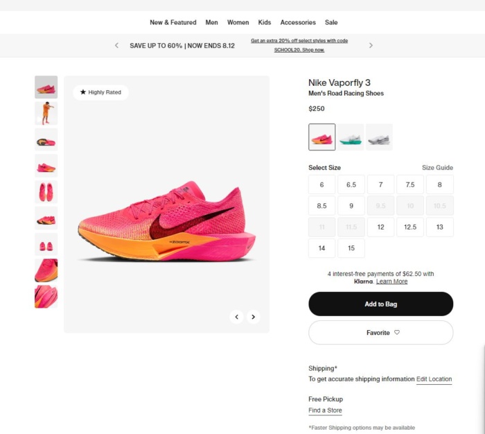
Source: Nike
For an e-commerce website, the goal might be to guide the user to make a purchase. Nike’s website is a great example here. Right from the homepage, the site leads users toward purchasing a product through an interactive and visually appealing product display.
Clicking on any product immediately presents you with straightforward shopping options. You can “Add to Bag,” “Favorite” items to view later, view all available color and size configurations, and even see which nearby stores have the product in stock. All guide the user toward the goal of a purchase while providing plenty of options to reach that goal.
Setting clear goals and guiding your users there is not just about leading them to complete an action. It’s also about ensuring they have a smooth, pleasant journey along the way. Remember, the more intuitive and enjoyable the path to the goal is, the more likely users are to take action. That’s why this UX best practice is integral to both user satisfaction and conversion rate optimization.
Test, Test, and Test Again
Finally, remember that designing a great user experience isn’t a one-and-done process. It’s iterative and should involve continuous testing and improvement. Tools like Google Analytics and Hotjar can provide valuable insights about your users’ behavior, helping you identify areas for improvement.
For example, you can use Hotjar’s heatmapping functionality to see where users move, click, and scroll. This shows you which design elements grab their attention and which they overlook entirely.
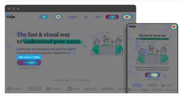
Source: Hotjar
A/B testing can also be particularly useful here. By testing different versions of your pages, you can determine what works best for your audience and make data-driven decisions. Constant testing and refining based on user feedback and behavior are crucial to creating and maintaining a great user experience.
FAQs
What Are UX Best Practices?
UX best practices refer to the proven methods and strategies for designing a website or app to provide the best possible user experience. These practices aim to meet users’ needs efficiently and effectively, making interactions with the website or app as pleasant and intuitive as possible. They include understanding your target audience, keeping the design simple, clear navigation, visual hierarchy, accessibility, streamlining forms and checkouts, mobile optimization, use of product filters and site search, clear communication of actions, guiding users to goals, and continuous testing and refinement.
How Do UX Best Practices Impact SEO?
UX best practices significantly impact SEO because search engines like Google prioritize websites that offer a good user experience. Factors like page loading speed, mobile-friendliness, easy navigation, and clear content organization contribute to a positive user experience and are important ranking factors in search engine algorithms.
How Can I Implement UX Best Practices on My Website?
To implement UX best practices, start by understanding your users. Use tools like Google Analytics to gain insights about your audience, then design your site to meet their needs. Keep your design clean and simple, use clear navigation, and make sure your site is accessible to all users. Test your design regularly to ensure it’s meeting your goals, and be prepared to make adjustments based on user feedback or changes in user behavior.
What Tools Can I Use to Test My UX Design?
There are numerous tools available to help you test your UX design. Google Analytics can provide valuable data about your users and how they interact with your site. Hotjar offers heatmaps and user session recordings to help you understand user behavior. Usability testing platforms like UserTesting allow you to gather feedback directly from users, and A/B testing tools like Optimizely or VWO let you test different versions of your pages to see which performs best.
How Important is Mobile UX?
Mobile UX is extremely important given the significant number of users accessing the web on mobile devices. A mobile-optimized site offers a better user experience and positively impacts SEO. Google uses mobile-first indexing, meaning it looks at the mobile version of your website for indexing and ranking. Hence, ensuring a good mobile UX is not just about the user experience. It’s a crucial aspect of your overall digital strategy.
Conclusion
UX is no longer a nice-to-have feature—it’s necessary for any brand that wants to remain competitive in today’s digital landscape and keep users on their site. Implementing these UX best practices can dramatically improve the user’s journey across your site, increase conversions, and elevate your brand reputation.
Remember, understanding your audience is extremely important. Everything you design should be with your users in mind. Keep things simple, prioritize accessibility, don’t forget about mobile, and never stop testing and refining.
Get started today by examining your site’s user experience and identifying areas for improvement. It may be time to revisit your mobile optimization. Or do your forms need streamlining for a smoother checkout process?
Every change you make can potentially improve your users’ experience and, by extension, your bottom line.
What’s the first UX improvement you’ll make on your site?
[ad_2]
Article link